Case Study · CARIAD · Volkswagen Group · 2022 to 2023
B2B App-Store Portals
Sole designer · B2B web portals · 3 portals · 8 brands
The governance layer for CARIAD’s in-car App Store, across three internal portals and eight VW Group brands. As the sole designer, I rebuilt the information architecture, five stakeholder journeys, a component system, and a hi-fi OEM Admin Portal. The approval pipeline ran about seven days, most of it manual handoffs, and shared state visibility removed them.
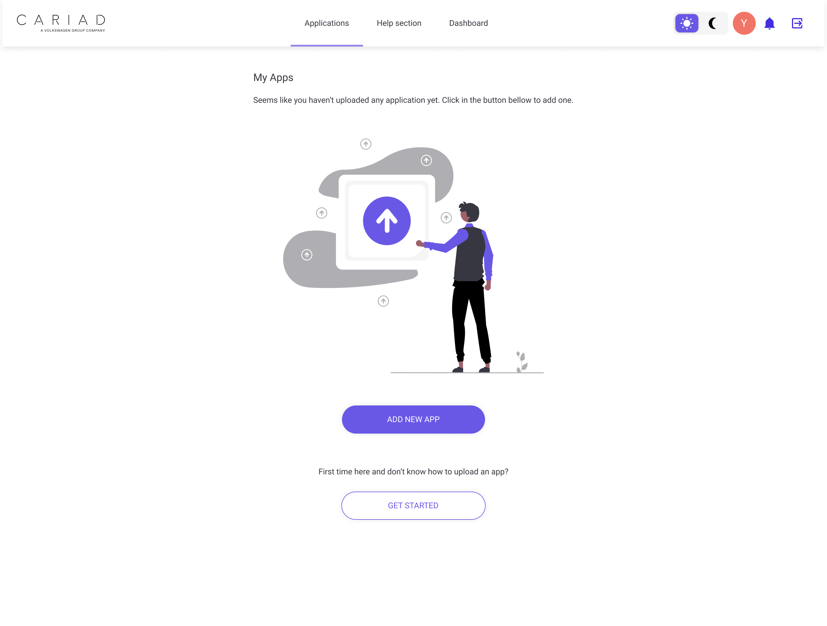
Before any app reaches a car screen, three internal portals decide what happens to it. None of them had been properly designed. I rebuilt the governance layer end-to-end: information architecture, user journeys for five stakeholder types, a component system, and a hi-fi OEM Admin Portal covering app discovery, lifecycle management, and brand-level approval.
CARIAD, Volkswagen Group’s software subsidiary, was building an in-car App Store on Android Automotive OS. Getting a third-party app onto a driver’s screen meant passing through three internal web portals, across the eight Group brands (Volkswagen, Audi, Porsche, Škoda, SEAT, and more), with no shared tooling. I joined the Group App Store team as the sole designer on the portal redesign.
Three portals, none properly designed
For an app to reach a driver’s screen, it had to pass through three internal web portals: one where third-party developers upload their APK, one where the central team reviews it, and one where each vehicle brand makes the final call. None of those portals had been designed with users in mind.
The QA team tracked apps in Excel sheets. There was no shared view of where an app sat in its lifecycle. Reviewers couldn’t see what was in the pipeline. Brand approvers had no analytics. The legal complexity, GDPR consent, geo-blocking, automotive compliance, was buried in code with no UI affordance. Internally everyone called it the API admin tool. The brief was to turn a backend into a system three teams could use.
No official Figma access. The organisation was Axure-locked, and Axure couldn’t support the component library and dark-mode work the team needed. I negotiated a workaround in week one. Every design decision had to be defensible without industry-standard tooling.
Sole designer on the portal redesign
I joined as a UX design intern in the Group App Store team. After the first month I was the only designer on the portal redesign work. I led discovery, research synthesis, lo-fi, hi-fi, the component library, and the documentation handed to engineering.
- Discovery interviews and heuristic audit
- Information architecture (3 portals)
- User journey mapping (5 stakeholder types)
- Lo-fi and hi-fi screen design
- Dual-mode component library
- Engineering handoff documentation
- Supervisor (design feedback, prioritisation)
- Developers and architects (1:1 discovery, technical constraints)
- QA team (test report workflow, lifecycle states)
- Legal and compliance (consent, geo-blocking, GDPR)
Three teams, three jobs to be done
The three portals serve three distinct stakeholder groups with conflicting needs. One UI couldn’t serve all of them, so each portal had to be designed around its specific user.
Discovery and an audit of the existing portal
There was no research budget and no access to OEM employees outside the company, so discovery had to come from inside: 1:1 conversations with developers, architects, and QA, plus a structured audit of the existing Developer Portal. That audit was the primary evidence source for the redesign.
The work ran in parallel tracks. I started low-fidelity on the Domain Approval portal first, an easier entry point that built team buy-in, then benchmarked Google Play for cars and the Apple App Store to inform the in-car Store surface.
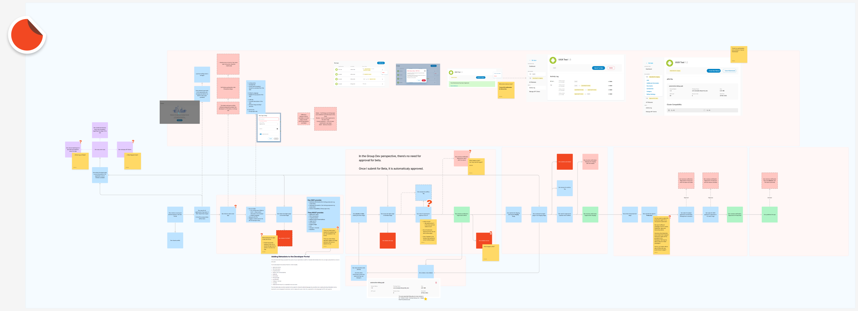
The approval pipeline as a system
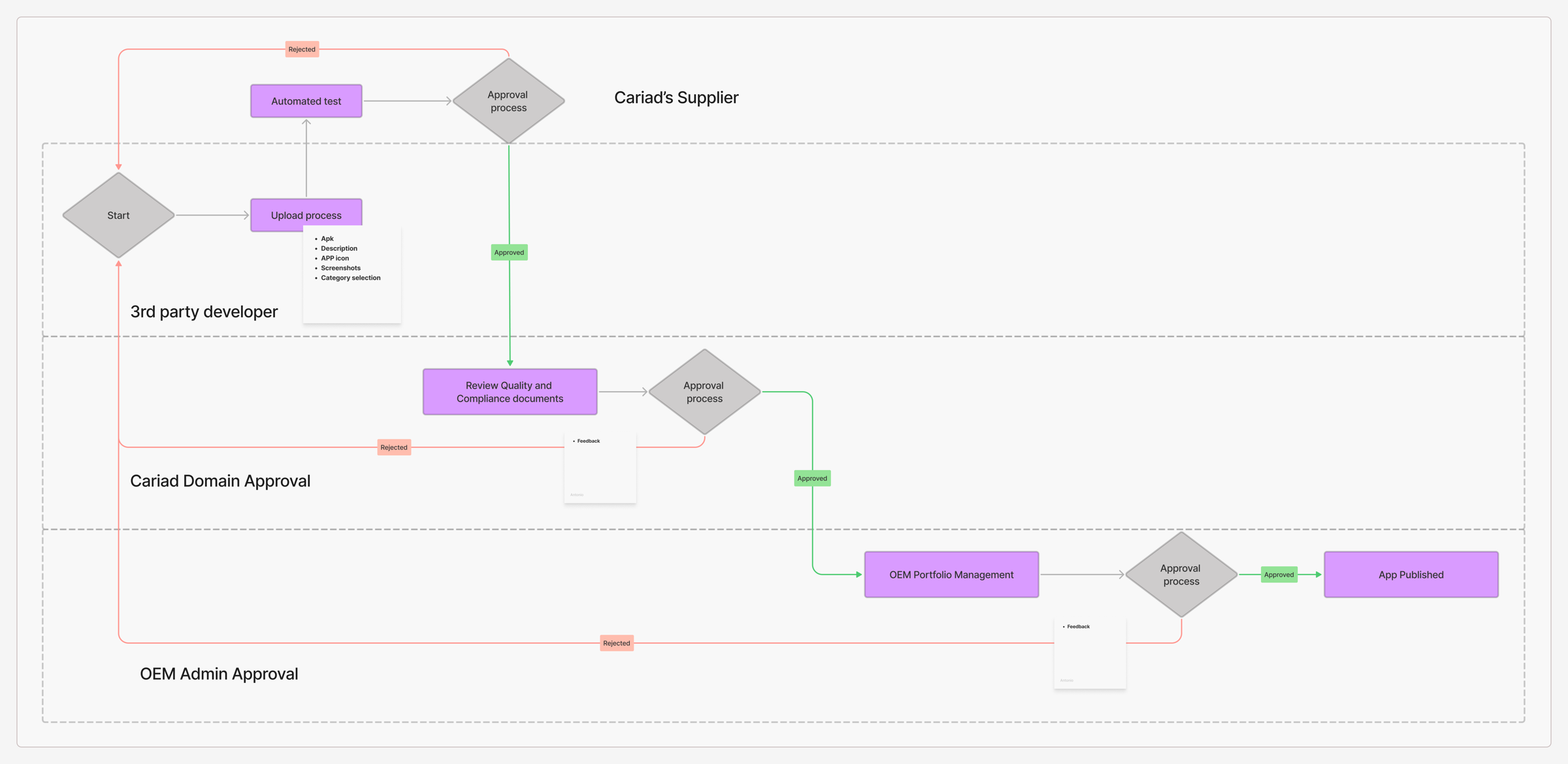
App approval pipeline · Developer upload through review and brand-level approval to publish
Before designing any screen, I mapped the full app lifecycle as a system: who touches an app at each stage, what decisions they make, and what state the app sits in between decisions. A swimlane across developer, supplier (smoke and manual testing, then an APK validator report), CARIAD reviewer, and brand admin put a rough number on it: around seven days end-to-end, most of it manual handoffs. That map became the spine for every IA decision that followed.
Five stakeholders mapped end-to-end
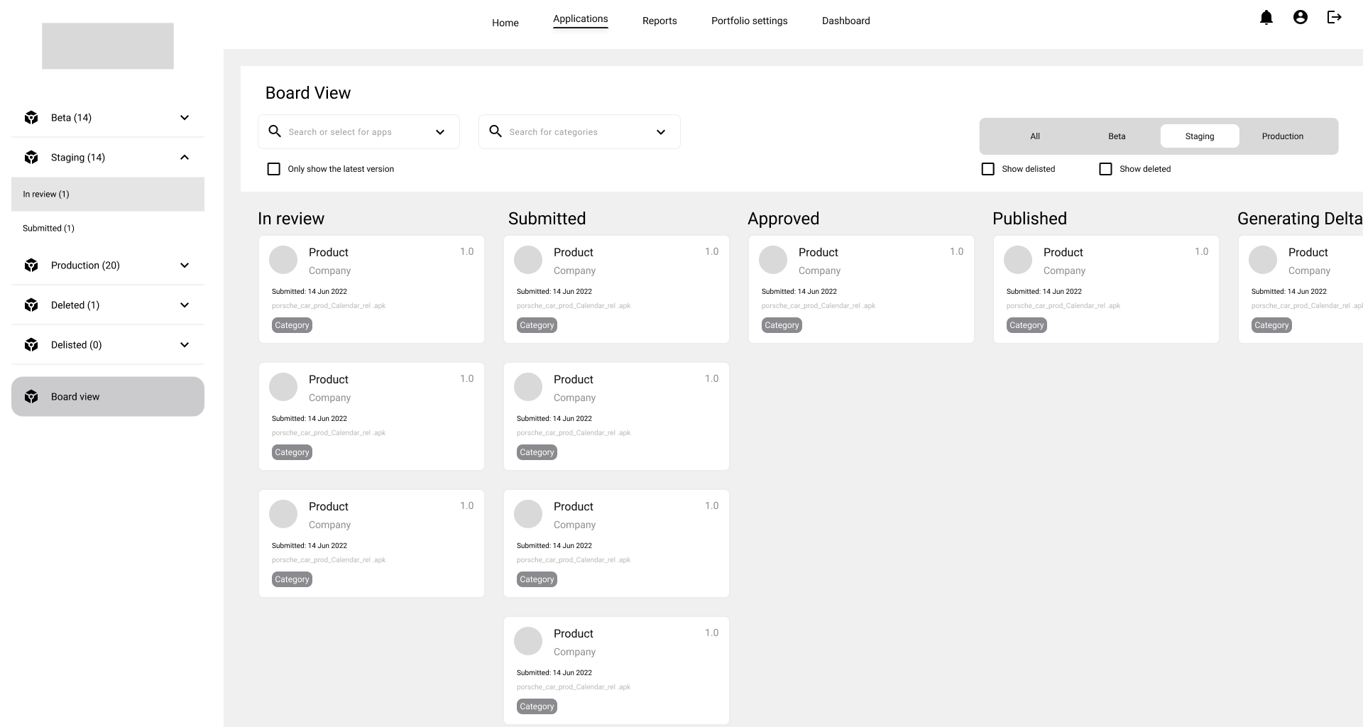
I built journey maps for each role: third-party developer, internal group developer, central reviewer, brand admin, and global admin. The internal group developer path diverged in one telling way: submitting for Beta auto-approved, where a third party had to wait. Each map surfaced the open questions engineering hadn’t answered yet. "What is Generating Delta?" "Do five lifecycle stages need to match between the reviewer and the brand portal?" "When a brand approves, what state does the app move to in the other two portals?" "When a brand force-uninstalls, does the app disappear from cars?" These questions drove the design decisions that followed.
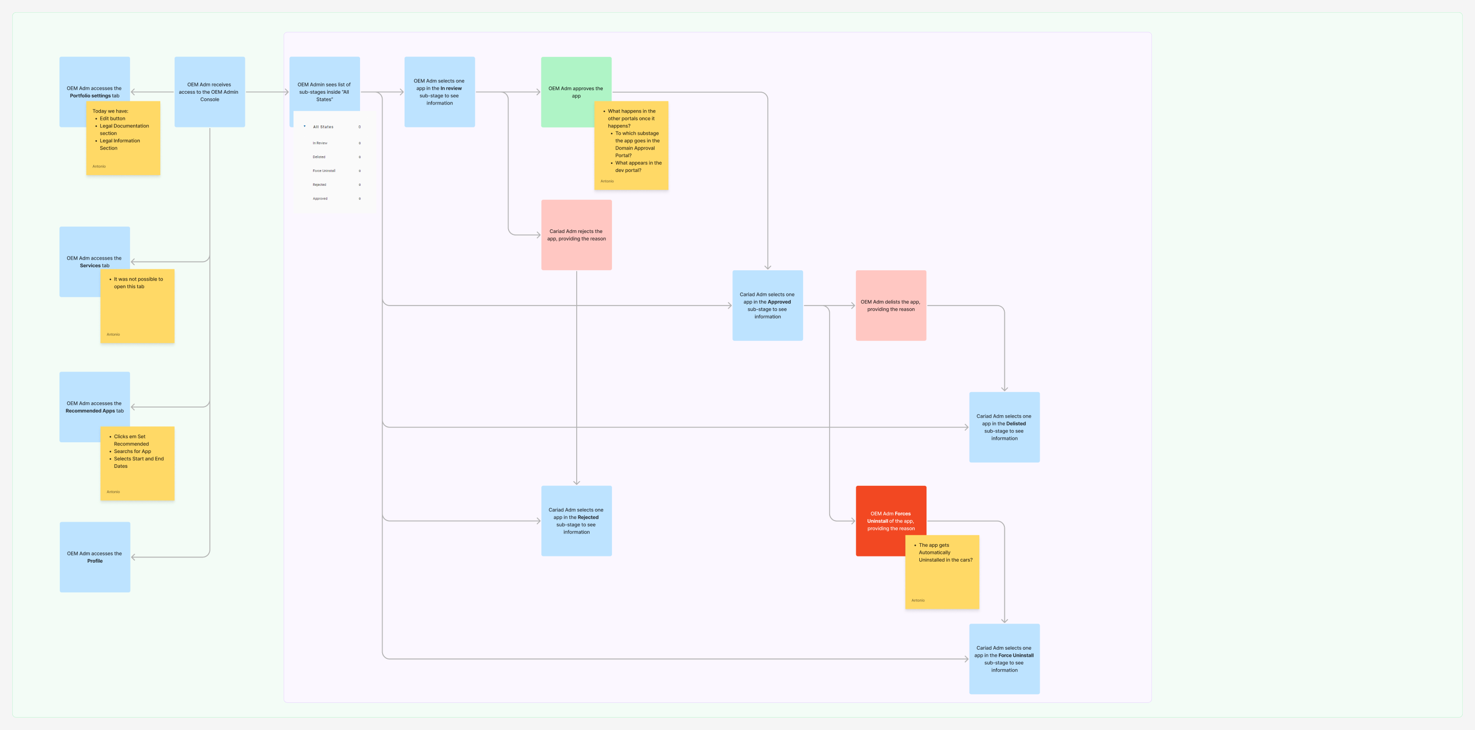
Key design decisions
- Kanban for state visibility: Excel-based tracking gave no shared view of pipeline state. A Kanban exposed bottlenecks per environment in one glance.
- Two Kanban views, one source of truth: Environment columns (Beta, Staging, Production) for brand admins; status sub-columns (In review, Submitted, Approved, Published, Generating Delta) for central reviewers. Different jobs, different lenses.
- Test report as a first-class object: QA results were buried in shared drives. Promoting them to their own tab with search, favourites, and per-app history removed Excel from the loop.
- Rejection reasons on the record: Rejections used to vanish into email. A timestamped evaluation history on each app, with the reason attached, meant a developer could see exactly why a build was turned down and who turned it down.
- Component system before screens: No Figma library existed. Building primitives first, a shared set of component groups, was the only way to iterate on three portals in nine months.
- Dark mode by default: Reviewers work long sessions, and reduced eye strain was a stated team ask. I built the token system dual-mode from day one.
What I found, and the moves it drove
The findings came from two streams that ran the whole time: a structured audit of the existing portals, and the workshops and walkthroughs I ran with central reviewers and brand admins as the designs took shape. Each finding paired with a concrete move and the lifecycle state it touched.
Validated with the people who would use it
Two of the three user groups sat inside the company, so I could test the work with them directly. Central reviewers and brand admins walked the flows in small workshops and internal sessions, and what they flagged fed straight back into the designs. The group I couldn’t reach was third-party developers, who sit outside CARIAD; validating with them is the gap I never closed.
What the sessions surfaced
- Reviewers and brand admins reviewed the flows in workshops and internal meetings; I worked their feedback straight into the proposals.
- No rework was requested at the structural level through the full handoff. The information architecture and lifecycle model held up under review.
- The in-car Store concept work, running in parallel, used the component library as its source of truth.
A component system before screens
No Figma library existed inside the organisation when I started. Three portals, nine months, and a single designer meant I couldn’t build screens linearly. I built the primitives first, a set of reusable component groups, then composed screens from them. I built every dark-mode token, state variant, and dropdown once and reused it across all three portals. This Figma library enabled:
- Iteration speed: Once primitives existed, screens took a fraction of the time. The OEM Admin hi-fi came together in roughly five weeks because the library underneath was already done.
- Consistency across portals: The Developer Portal and Domain Approval prototypes shared the same library. Three portals, one visual system, half the maintenance cost.
- Engineering handoff: Engineers got a one-to-one component map. Variants in Figma matched the prop API I proposed for the front end, which cut handoff back-and-forth.
One system behind every screen
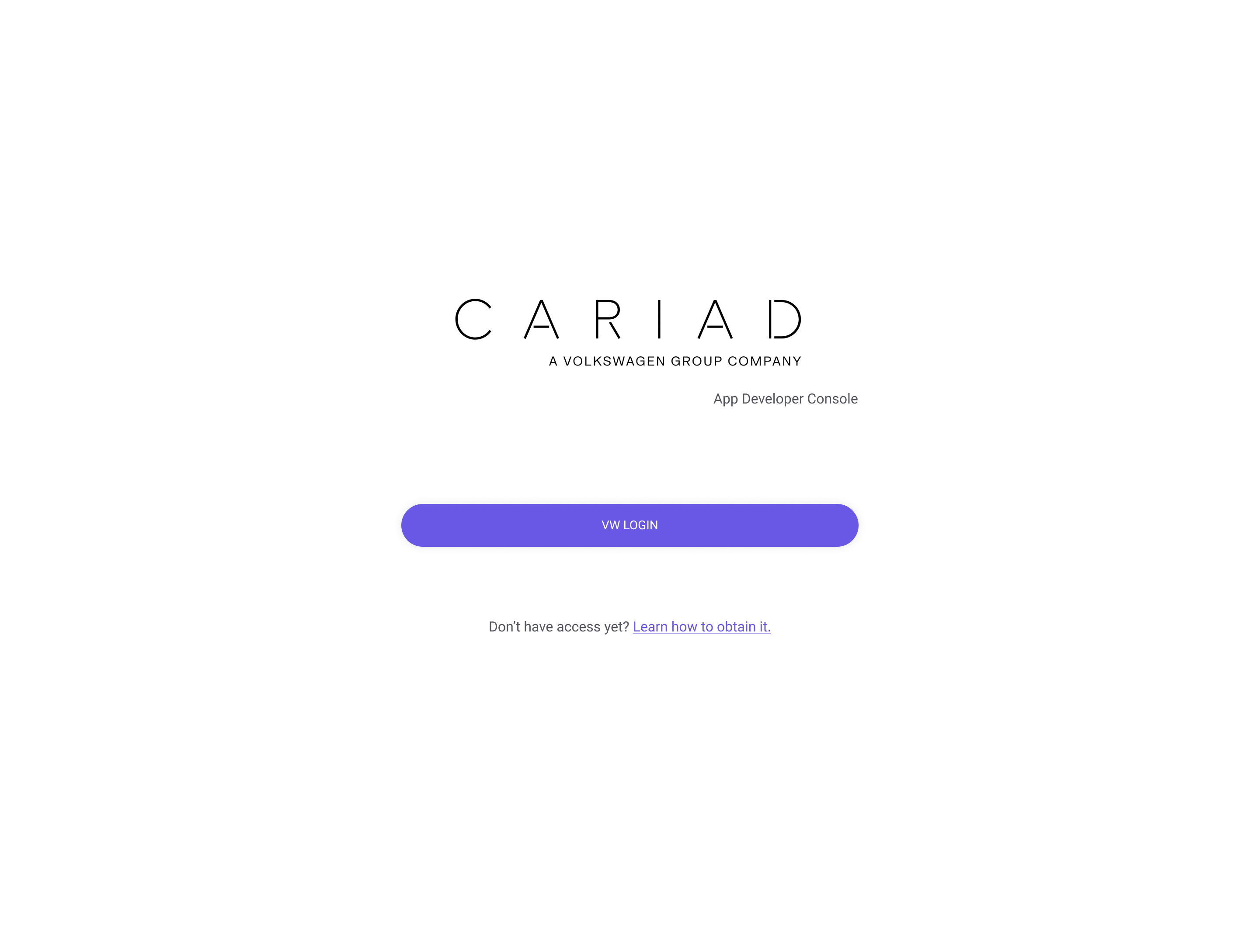
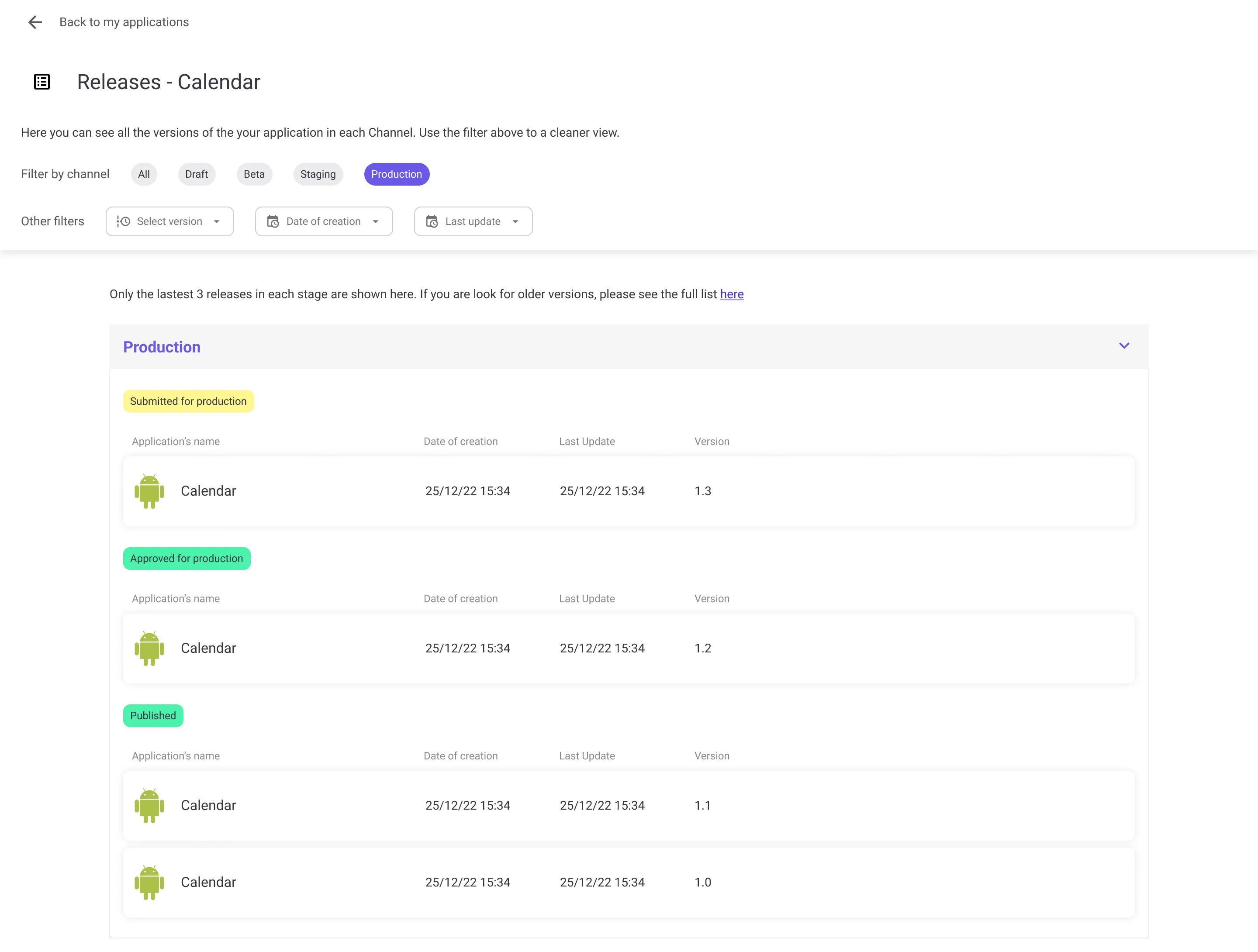
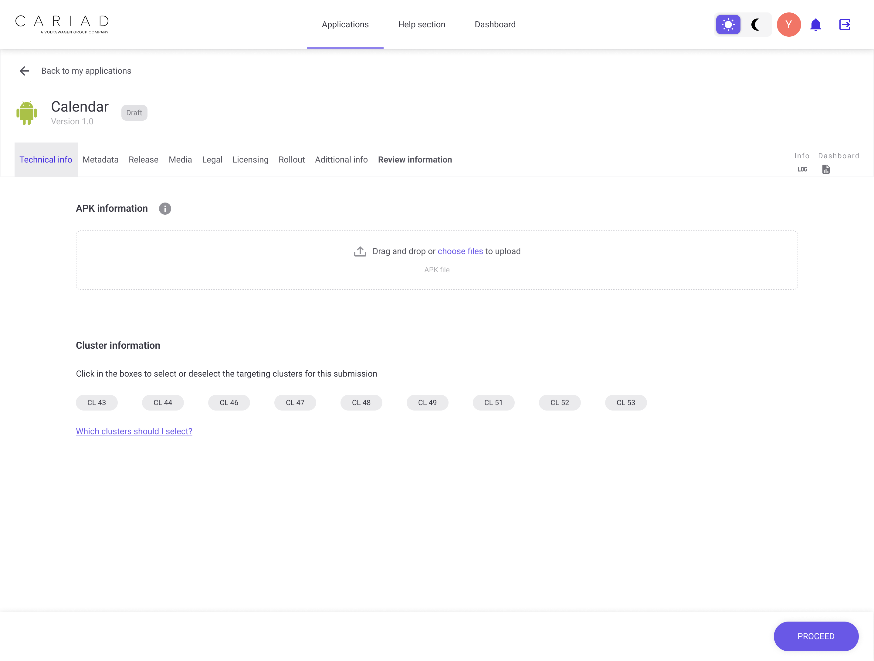
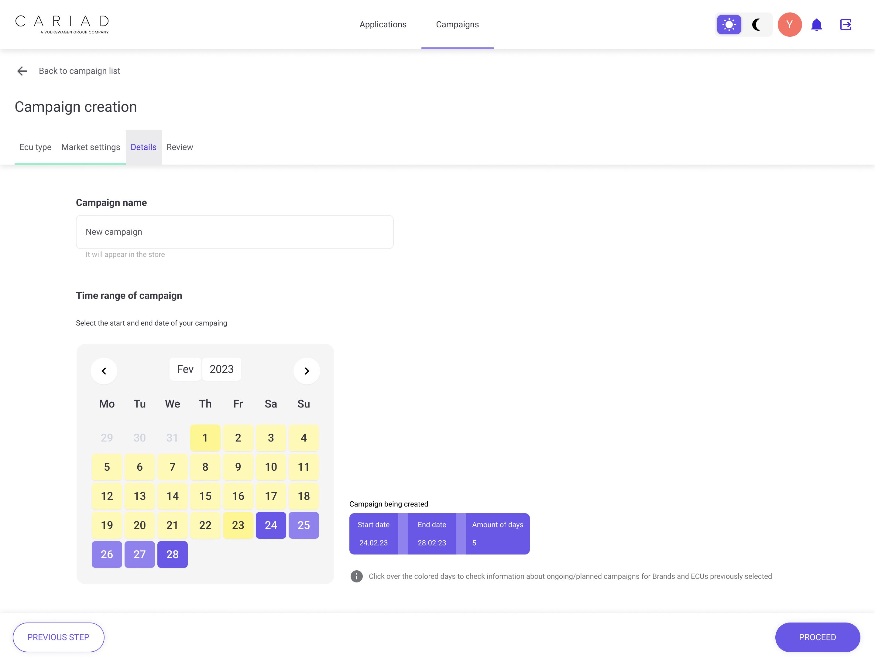
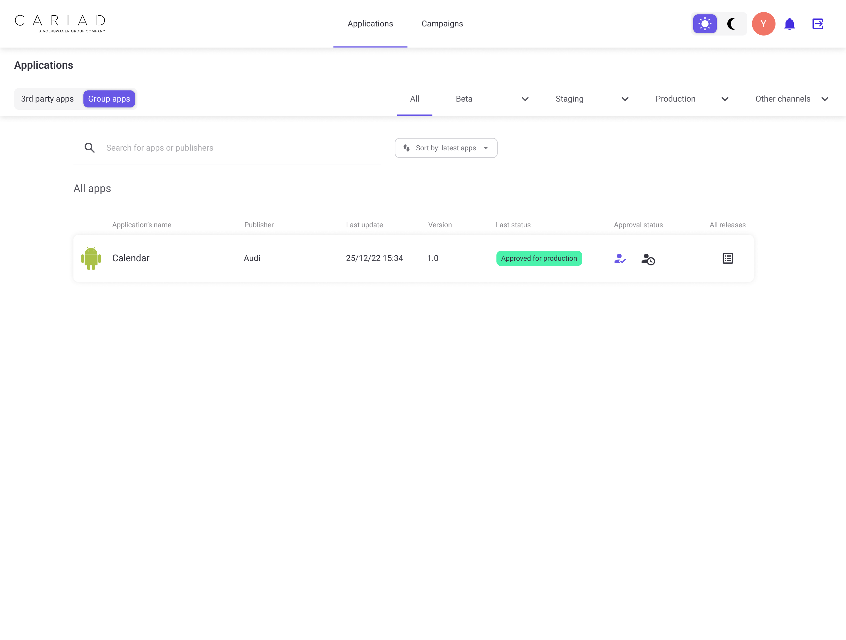
The OEM Admin Portal hi-fi, composed from the component library. The whole portal was designed iteratively, in a continuous back-and-forth with developers and stakeholders, so the decisions and the system evolved together. What follows is a representative sample of that work, not the full set; each screen is annotated with the decision it represents, not what it looks like.
What I delivered, and what it changed
- OEM Admin Portal hi-fi: Login, my apps, all releases, app detail, campaigns and the approval flow among the screens, in light and dark mode, fully composed from the component library.
- A dual-mode component library: Reused across all three portals. The first shared design system the Group App Store team had access to.
- IA and approval pipeline maps: One canonical diagram answering "where does this app go next?", adopted as the shared reference by every team touching the pipeline.
- Five end-to-end journey maps: One per stakeholder type, with open questions surfaced so product could close them.
- Audit findings and redesign moves: A working document mapping each usability problem to a specific redesign decision and lifecycle state.
- Atomic UX Research synthesis of legal and product findings: Consent, geo-blocking, payment, and update policy organised as design opportunities.
What I’d do differently
Find a way to talk to real users
The biggest gap in this work was that I never sat with a third-party developer, a central reviewer, or a brand admin while they tried to do their job. I told myself this was an access constraint, but in retrospect there were routes I could have negotiated: shadowing QA during test bench runs, a screen-share session with one developer team, even a remote walkthrough with a brand approver. I would push harder on that today, and I’d push earlier.
Push back on the five-stage lifecycle
I designed around Beta, Staging, Production, Deleted, and Delisted because that’s what engineering described as the existing pipeline. Looking back at my own journey maps, the open question "are five stages necessary?" sits on a sticky and is never resolved. A designer in a system this complex shouldn’t only render the existing model; the job is to challenge it. I rendered when I should have challenged.
Vocabulary matters as much as the screens
My audit caught the system using Delete, Revoke, Cancel Submission, and Delist almost interchangeably, four words for overlapping destructive actions, and a sticky note asking which meant what. I flagged the confusion but never delivered a resolved vocabulary the three portals could share. In a multi-stakeholder system, naming is interface: a content and state model that pinned each term to one action would have removed a whole class of user error. I’d treat that terminology as a deliverable next time, not a footnote.