Case Study · WS Audiology · Signia · 2023
Connexx B2B tool facelift
Designer · Signia desktop fitting software · UI refresh and usability validation
A facelift of Signia’s Connexx fitting software for hearing-care professionals. I ran usability testing with twelve HCPs across two markets and fixed navigation, terminology, and status feedback without touching the underlying tool. 12 of 12 testers completed five of six tasks unaided, and the terminology research drove the redesign.
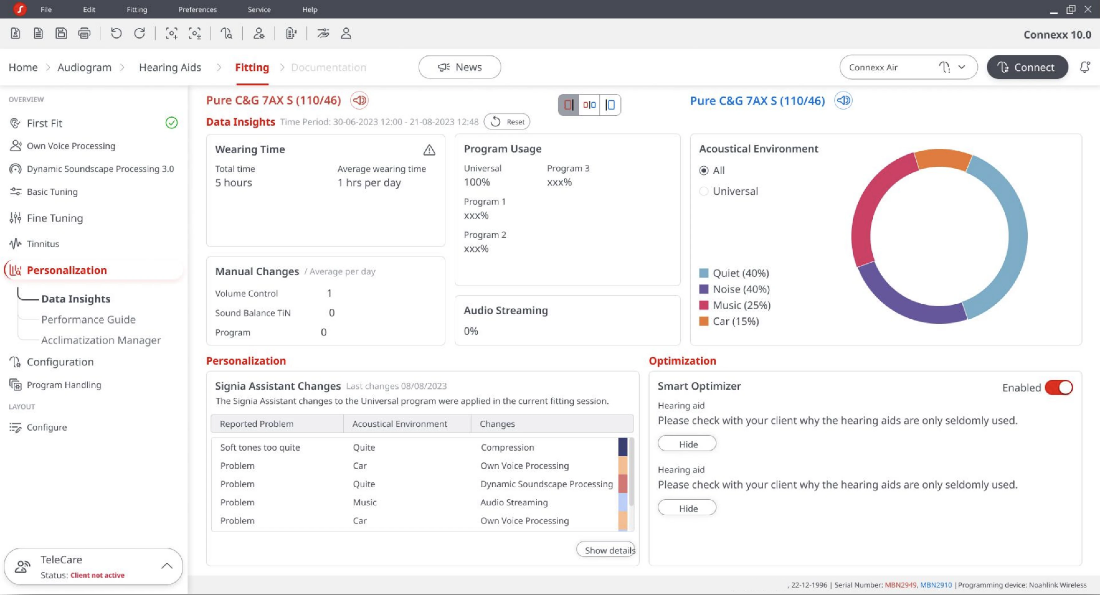
Connexx is the desktop software hearing care professionals use every day to fit Signia hearing aids. Version 10.0 needed a modern look without disturbing the muscle memory of the people who live in it. I helped run a moderated usability test of the refreshed interface with twelve professionals across the UK and Germany, then turned what I saw into the changes that shipped.
Connexx 10.0 is fitting software: HCPs use it to run hearing tests, tune sound, and manage patient data in the shop. The brief asked for a facelift: a new flat illustration style, refreshed Signia iconography, an updated colour palette. One hard rule shaped all of it. I could not touch the UX workflows, the codebase ruled that out, so I solved every problem in the visual layer.
Software people live inside
Connexx is specialised fitting software. An audiologist or dispenser opens it in the shop to run hearing assessments, customise sound for a patient, manage their history, and get the hearing aids performing. Many HCPs use it daily, so interface familiarity is high, and any change risks breaking the muscle memory built over years.
The look had to move forward; the flows could not. Connexx is a legacy Windows application, and its codebase did not allow functional change, so the facelift carried all the weight: a new flat illustration style, refreshed Signia iconography, and a new colour palette, layered onto screens whose information architecture stayed exactly where users expected it.
A facelift is harder than a redesign. A legacy codebase froze the flows, so I had to solve every problem in the visual layer.
I owned the redesign and ran the research
I was the designer on the facelift. I owned the visual redesign across the high-frequency fitting screens and the Figma component library behind it, co-authored the moderated test script, and built the clickable prototype in both languages. I ran the UK sessions myself and sat in on the German sessions at EUHA as note-taker, then turned the feedback into the changes that shipped.
- The visual redesign of the high-frequency fitting screens
- A reusable Connexx component library in Figma
- The clickable prototype, German and English
- The UK usability sessions, end to end
- Analysis and the recommendations that fed the release
- Iconic UX team: test script, design reviews
- Twelve HCP participants: UK remote and German in person
- Product stakeholders: the facelift brief and its limits
Two HCPs, opposite habits
Before designing, I built two personas from the panel’s profiles and pre-interviews to anchor the decisions. The facelift had to serve both at once: keep the expert’s flow intact while making the occasional user’s re-entry faster.
What I kept, and why
Some conventions did real work, and the facelift kept them. The one that mattered most was the ear colour coding, shared across Connexx, the companion apps, and Signia marketing.
Before and after
Same Basic Tuning screen, same controls in the same places. The facelift redrew the chrome, the icons, and the palette, and opened up the white space.
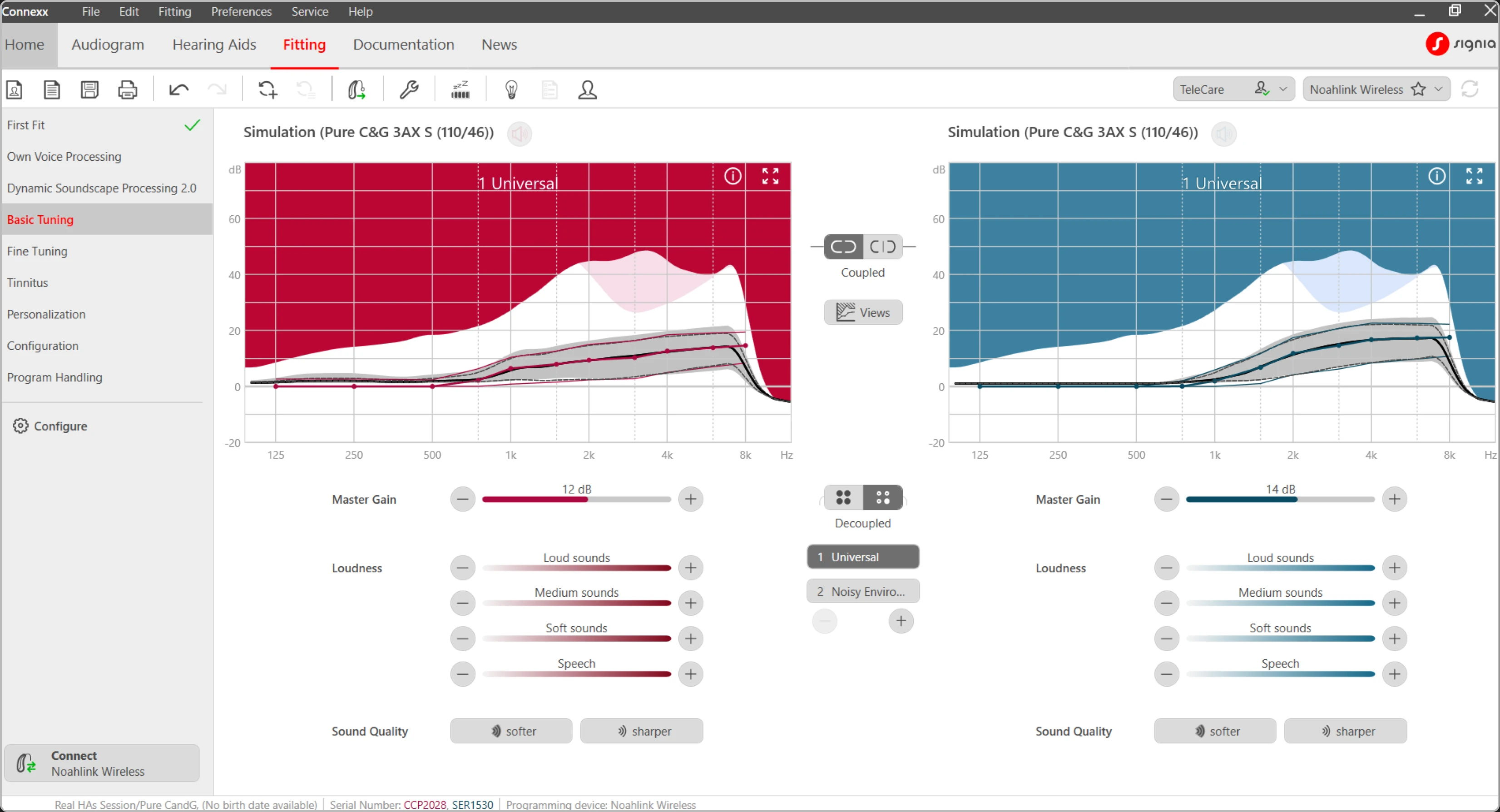
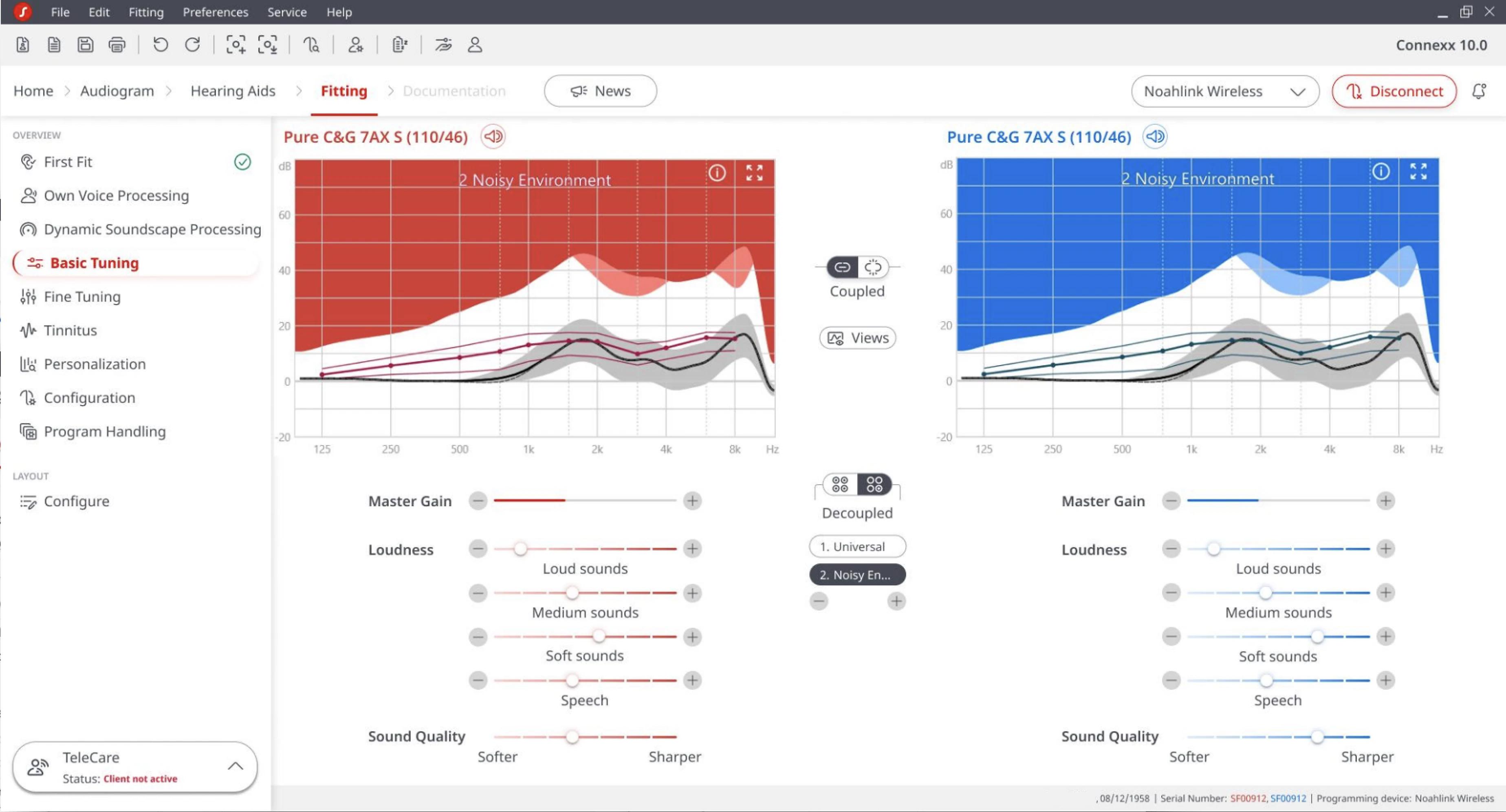
Red means right, blue means left. Continuity across the product family outweighed any visual-debt argument; changing it would break recognition everywhere, in the software, the apps, and the marketing.
Briefed by the 2023 Signia brand refresh. Replaced the older skeuomorphic style with something lighter and closer to the marketing site, on a screen HCPs stare at all day.
Chosen for the modernistic touch in the brief, closer to current SaaS conventions. I accepted the trade-off up front: calmer, but a contrast risk. Several HCPs said it “blurs into one.”
Pre-interviews confirmed most HCPs already default-land there and find it useful. I kept the default; only the name changed.
A technical limitation, not a design choice. Every screen kept its existing information architecture, and the visual layer did all the lifting.
Palette · what the screen carries
Accessibility
Connexx is a legacy Windows desktop application; the codebase limits control over type scale and contrast tokens, so a full WCAG pass was out of scope for a facelift. The strongest win the visual layer allowed was enlarging the base font, driven straight by the “font is small, people leaned in” feedback. I flagged the low-contrast secondary nav as debt and logged the red/blue dependency as a colour-blind risk for the roadmap. The facelift moved the baseline and named the debt for the next release to absorb.
The redesign, screen by screen
I owned the visual redesign across the screens HCPs touch most. Each kept its workflow and changed only its surface.
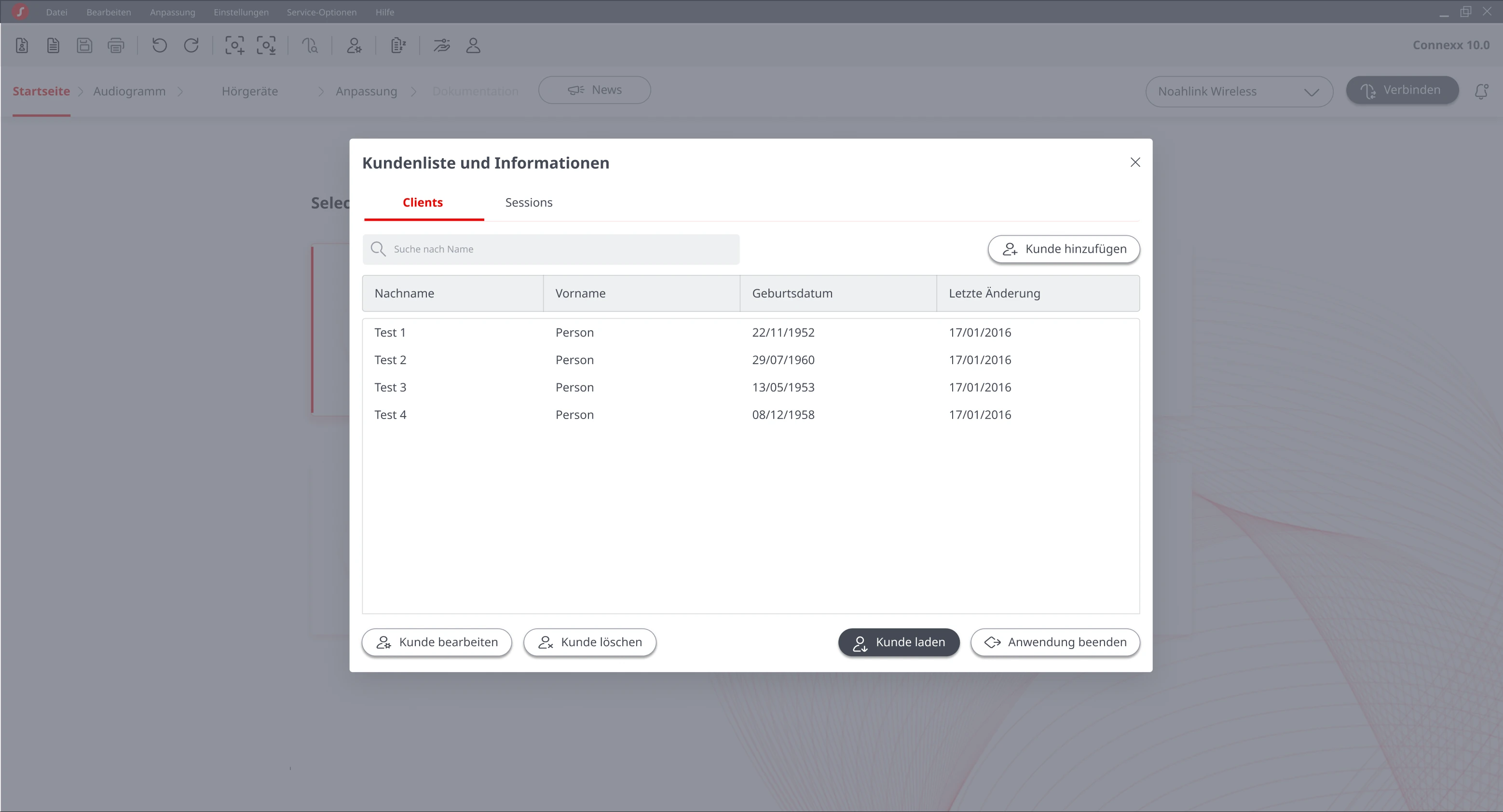
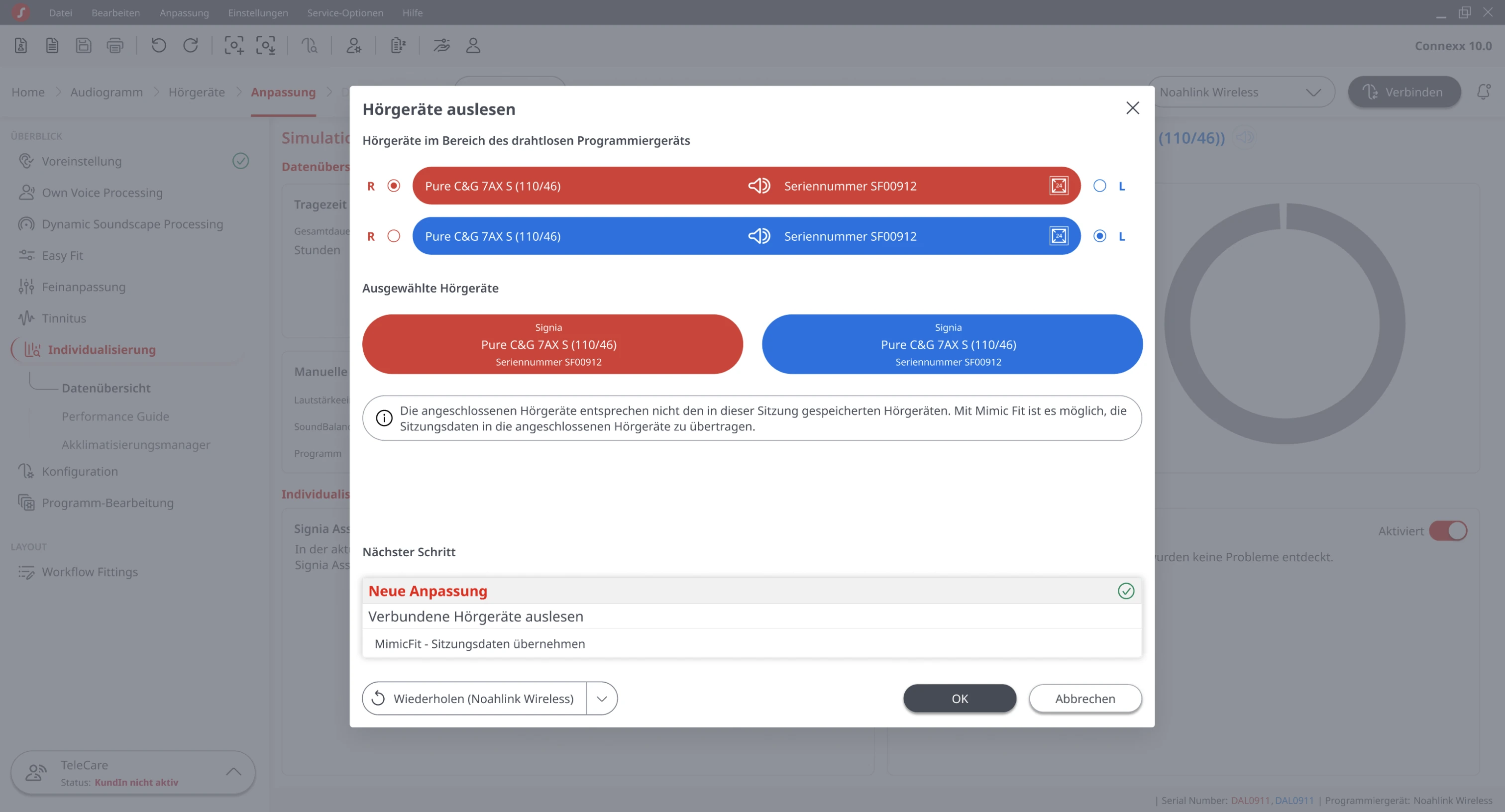
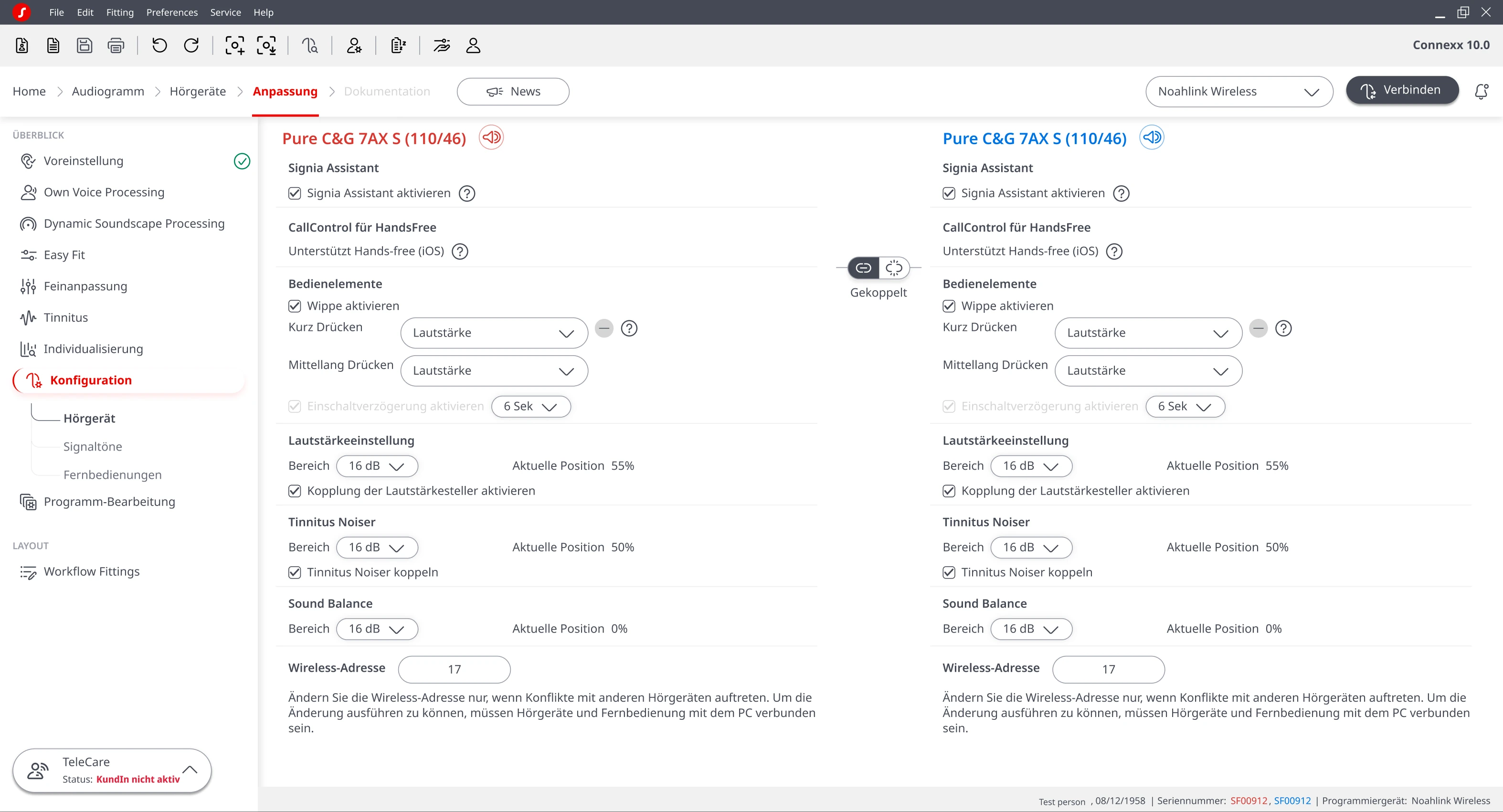
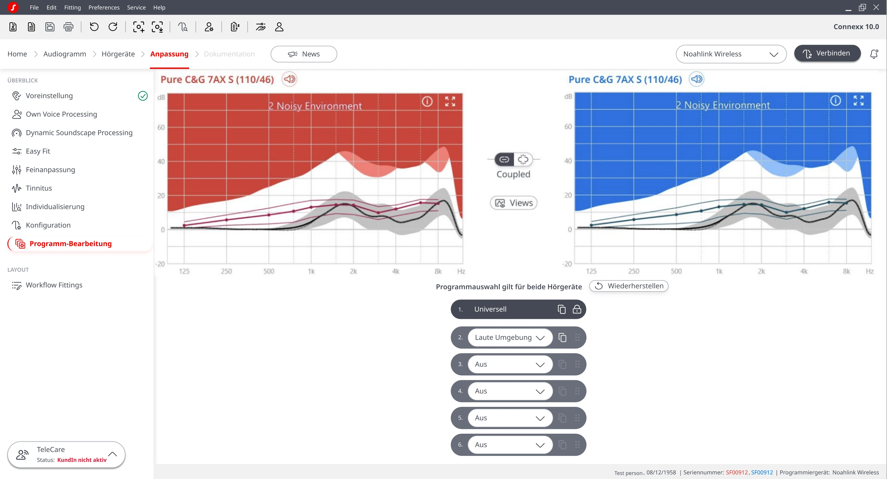
German prototype build · the workflow underneath is identical to the English version
A component library for Connexx
The facelift could not stay a loose set of screens. The same parts repeated everywhere: the red and blue device cards, the gain graphs, sliders, program pills, dialogs, the secondary-nav flyout. So I standardised them into a reusable Connexx component library in Figma. It held the redesign consistent screen to screen, made handoff to engineering legible, and gave whoever came next a system to build on. I shipped the new screens; the library is how the team keeps them coherent after I left.
Six tasks, two languages
The moderated test ran on a clickable Figma prototype, in German and English, with twelve HCPs whose experience ranged from two to forty years. I ran the five UK sessions remotely myself; the seven German sessions at EUHA I attended in person as note-taker. Six scripted tasks, each with a defined start state, a goal, and a success criterion, plus a follow-up question like “do you think the hearing aids are now connected?” I scored every task as completed unaided, completed with a hint, or failed. Twelve participants covered both markets and the daily-versus-occasional split, past the point where new issues kept surfacing.
Six scripted tasks · German in person at EUHA, English remote in the UK · Task 4 is where it broke down
What worked, what to fix
Twelve of twelve completed five of the six tasks without help. Task 4, setting a rocker-switch trigger in Configuration, needed hints for four of them, and that pointed straight at navigation and labelling.
What worked
- Structure read as tidier and more equalised than before
- Landing on Data Logging matched what HCPs wanted to see first
- The Connect & Detect dialog was self-explanatory; the Connect button was spotted immediately
- Red and blue coding let people identify left and right at a glance
- Distinct, clearer icons in the secondary navigation
- Program Handling read as simple, not nested: “beautiful, with the hook on the left”
What to improve
What shipped
These findings shipped as UI changes in the Connexx 10.0 release: one fix per pain point, numbered to match the four findings above.
- 01 · Readable hierarchy: larger body font, desaturated section titles, and real contrast between cards, dividers, and background to break the wall of white.
- 02 · Language that matched users: “Data Insights” renamed to “Data Logging,” the Personalisation / Configuration / Program Handling cluster reordered, and tooltips added to the secondary-nav icons.
- 03 · Clear connection status: a connected / disconnected state pill replacing the easy-to-miss “Simulation” badge, and a stronger left/right side indicator.
- 04 · A safer Connect & Detect flow: a Disconnect button on the post-connect screen, no pre-selected “New fitting,” and secondary detail collapsed into an expandable section.
12 of 12 testers completed five of the six tasks unaided. Only Task 4, setting a rocker-switch trigger in Configuration, needed hints, and it pointed straight at navigation and labelling. Testers backed that up in their own words: occasional users could not tell Personalisation, Configuration and Program Handling apart, and everyone called the landing screen “Data Logging,” nobody said “Data Insights.”
Sent forward
A dedicated contrast pass, colour-blind-safe alternatives to the red/blue dependency, and terminology research run upstream, before the next visual test rather than inside it.
On impact
Shortly after launch the B2B side of Connexx moved to another team in a re-org, so post-launch measurement lived with them. What I can show is the design that shipped and the research that shaped it.