Case Study · Universidade de Brasília · 2022
A platform for active learning
Sole Designer · Web & Mobile · Problem-Based Learning platform
Two semesters as the sole designer on PUMA, an active-learning platform at the University of Brasília. Usability-tested and redesigned the discipline-management module, then built the eight-page public environment for desktop and mobile from a requirements list, and validated it with external agents and students.
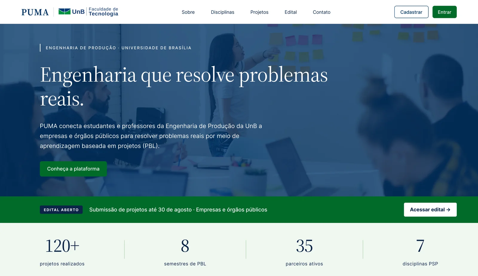
PUMA connects real-world problems from companies and public organizations to university students and professors, so those problems get solved as coursework.
PUMA (Plataforma Unificada de Metodologias Ativas) is a web platform built by the Production Engineering department at the University of Brasília to run PBL across seven project disciplines. When I joined as the sole designer, several modules were already coded but had never been usability-tested, and the entire public-facing environment existed only as a list of requirements.
Coded, but never tested, and half-built
Getting a real problem from an external organization onto a student’s desk meant passing through PUMA: an external agent submits it, a professor evaluates and allocates it to a class, students pick it up and deliver. The loop only works if every actor can use the platform, and two parts of it could not.
The discipline-management module professors used every semester had unclear forms and confusing navigation. And the external environment, the public pages where an external agent first learns about PUMA and submits a project, did not exist as a design at all. Without it, the core learning loop could never start. Those two became the brief.
One designer, one semester per cycle, a complex multi-module platform that takes on a new designer each year. Scope had to be cut hard and prioritised with stakeholders, and every call made against the clock.
Sole designer on a multi-module platform
I worked inside the department’s agile team across two semesters in 2022, the sole designer on the platform.
What I owned
- Understand the platform, its users, and its state
- Usability-test the discipline-management module
- Redesign that module and hand it off
- Prototype the external environment for desktop
- Prototype the external environment for mobile
- Run mobile usability tests and document findings
Who I worked with
- Project lead (direction, design feedback)
- Development team (acceptance criteria, handoff)
- Stakeholders (scope, prioritisation)
- The previous designer (context handover)
One platform, three user types
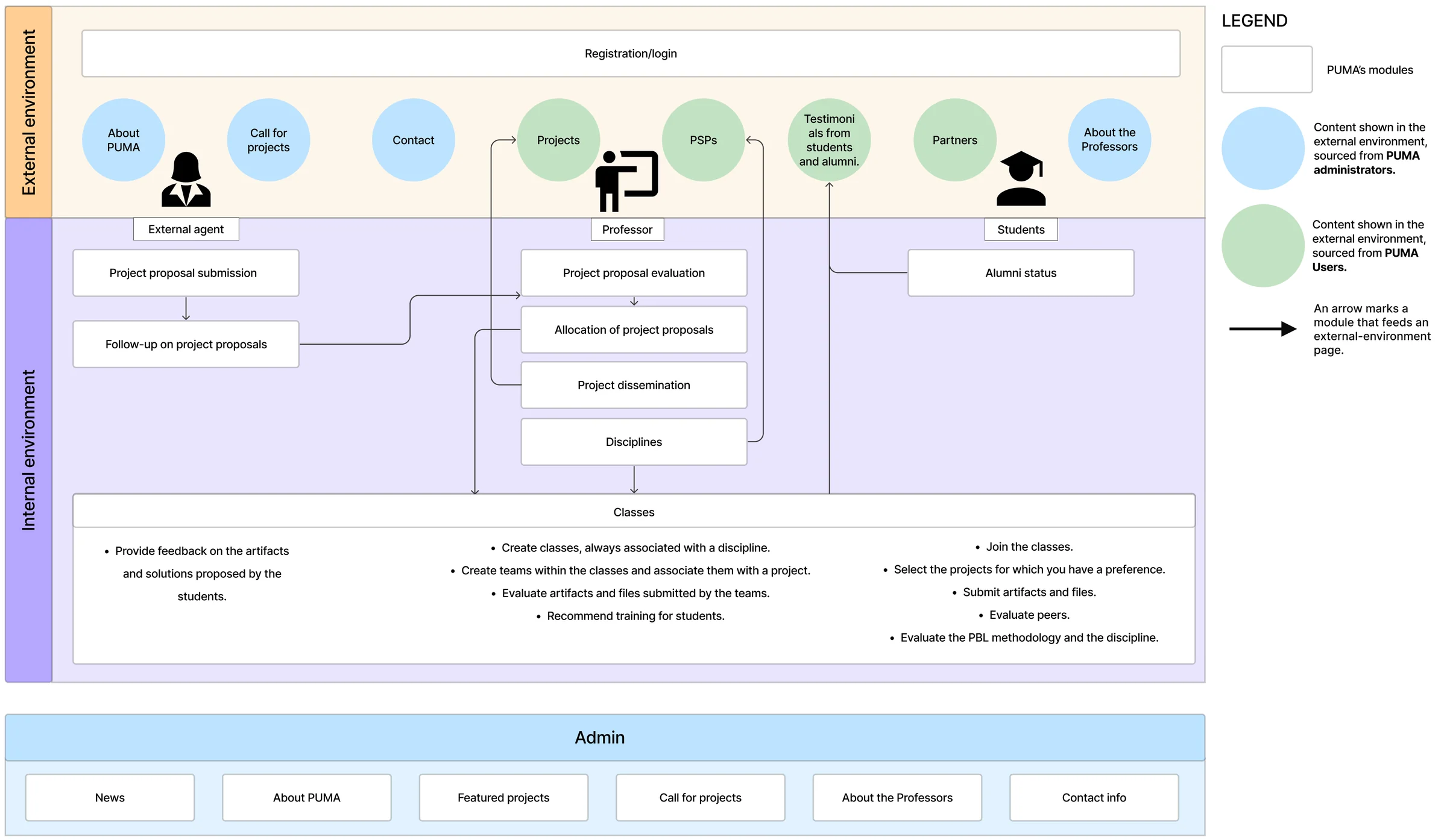
I read the prior academic work on PUMA, met the stakeholders, and sat with the previous designer, then mapped what I found as a functional architecture map: every module, who reaches it, and what was built versus pending. Identifying the three user types came out of the same phase, and I leaned on that map for every decision that followed.
Re-grounding the visual system in UnB’s brand manual
I inherited a partial design language from the previous designer, a navy base with a yellow accent, and re-grounded it in the university’s official Manual de Identidade Visual, the UnB guia prático. The manual specifies no yellow, so I dropped it: UnB blue (#003366, Pantone 654) anchors the hero, footer, and headers, and a UnB green carries the primary calls to action. For type I paired Source Serif 4, an editorial serif that gives the public surface a scholarly feel, with Inter for UI and body, a screen-built humanist sans that echoes UnB’s Helvetica spec and renders Portuguese diacritics cleanly. The public pages took editorial cues from Stanford Magazine and Aeon; the internal admin borrowed dashboard patterns from Linear and Stripe. One system, two registers.
Colour · from UnB’s manual
Yellow removed. The manual specifies none.
Typography
Display & headings
Source Serif 4
Editorial serif · scholarly weight for the public surface
UI & body
Inter: built for screens, clean PT-BR diacritics
Humanist sans · echoes UnB’s Helvetica spec
An initial validation of the current module
Discovery started here. Before changing anything, I usability-tested the discipline-management module as it already stood, coded but never tested, to find where it broke down for the professors who used it every term. I ran it with four academic professors over remote sessions: log in, reach the disciplines module, create a discipline, open its details, edit it, delete it. One theme ran through every session: clarity of labels and content mattered more than features. Each finding turned into a specific redesign move.
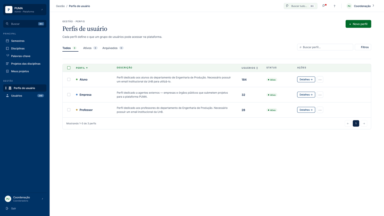
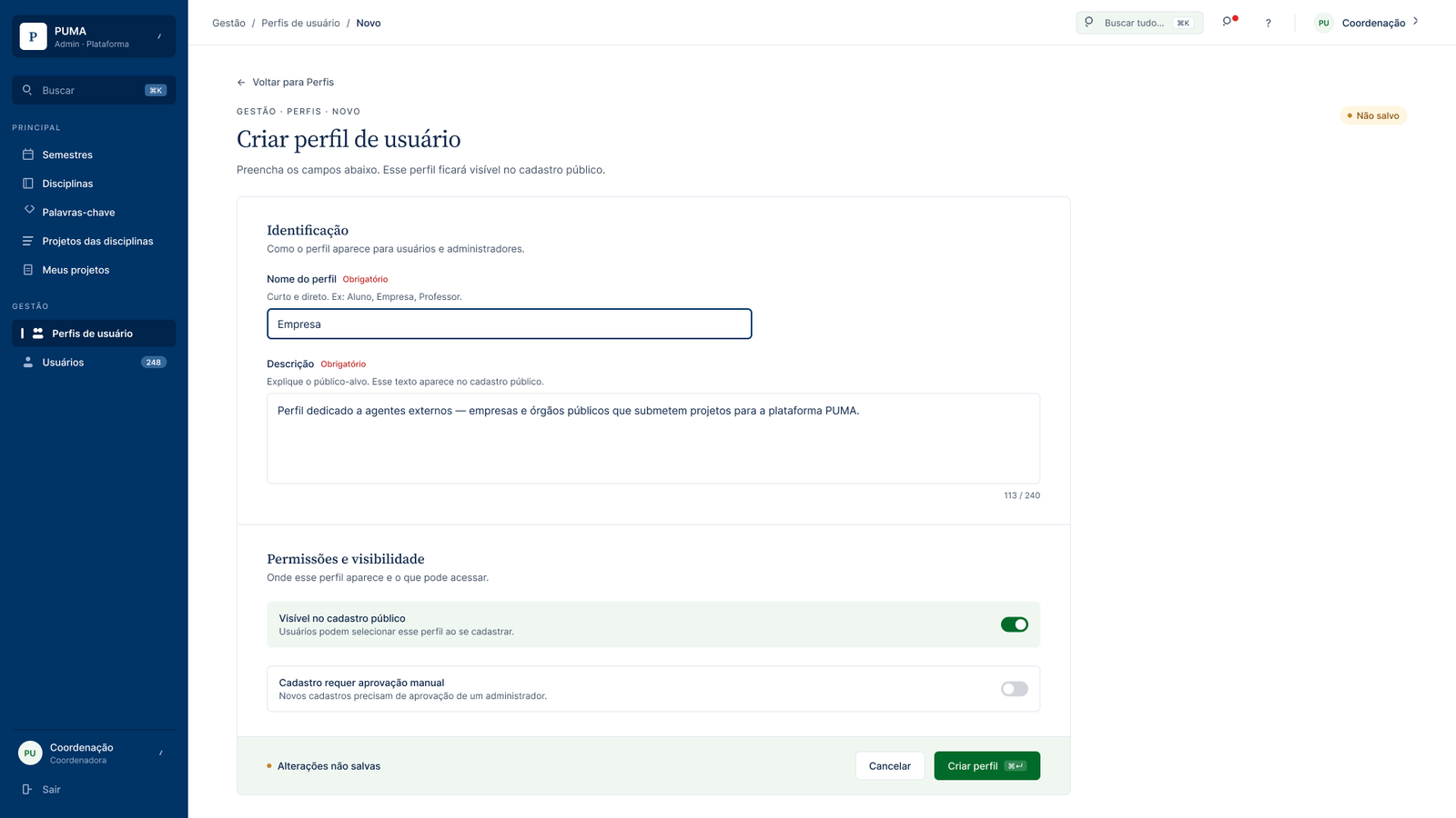
The redesign, applied across the internal admin
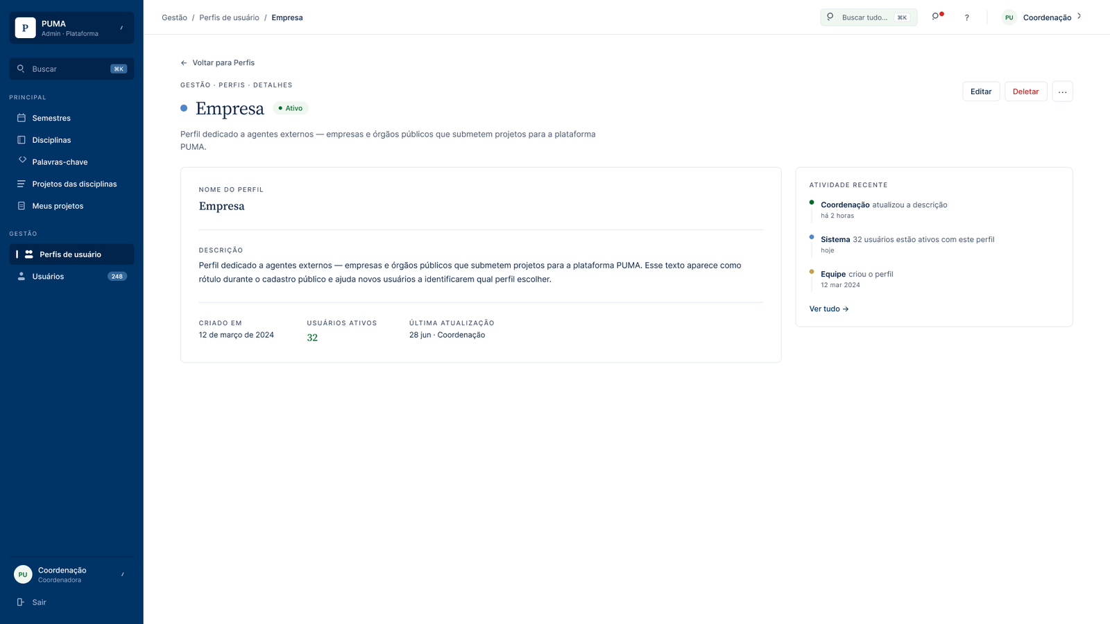
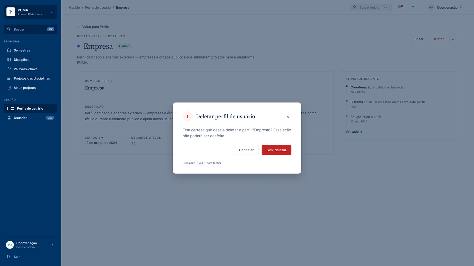
The findings weren’t unique to one form: opaque labels, edit and delete hidden from the detail view, one-click destructive actions, and silent failures were patterns. The redesign answered them across the whole internal admin, rebuilt on the UnB design system: Source Serif 4 and Inter, UnB blue and green, a Linear-style sidebar with grouped navigation and a command-palette shortcut, Stripe-style page headers and breadcrumbs.
How the team worked week to week
Improvements moved through a weekly loop, mapped as a swimlane so every actor knew where a feature sat and what came next.
Weekly improvement loop · usability test through development and QA · one pass per feature
The external environment, built from zero
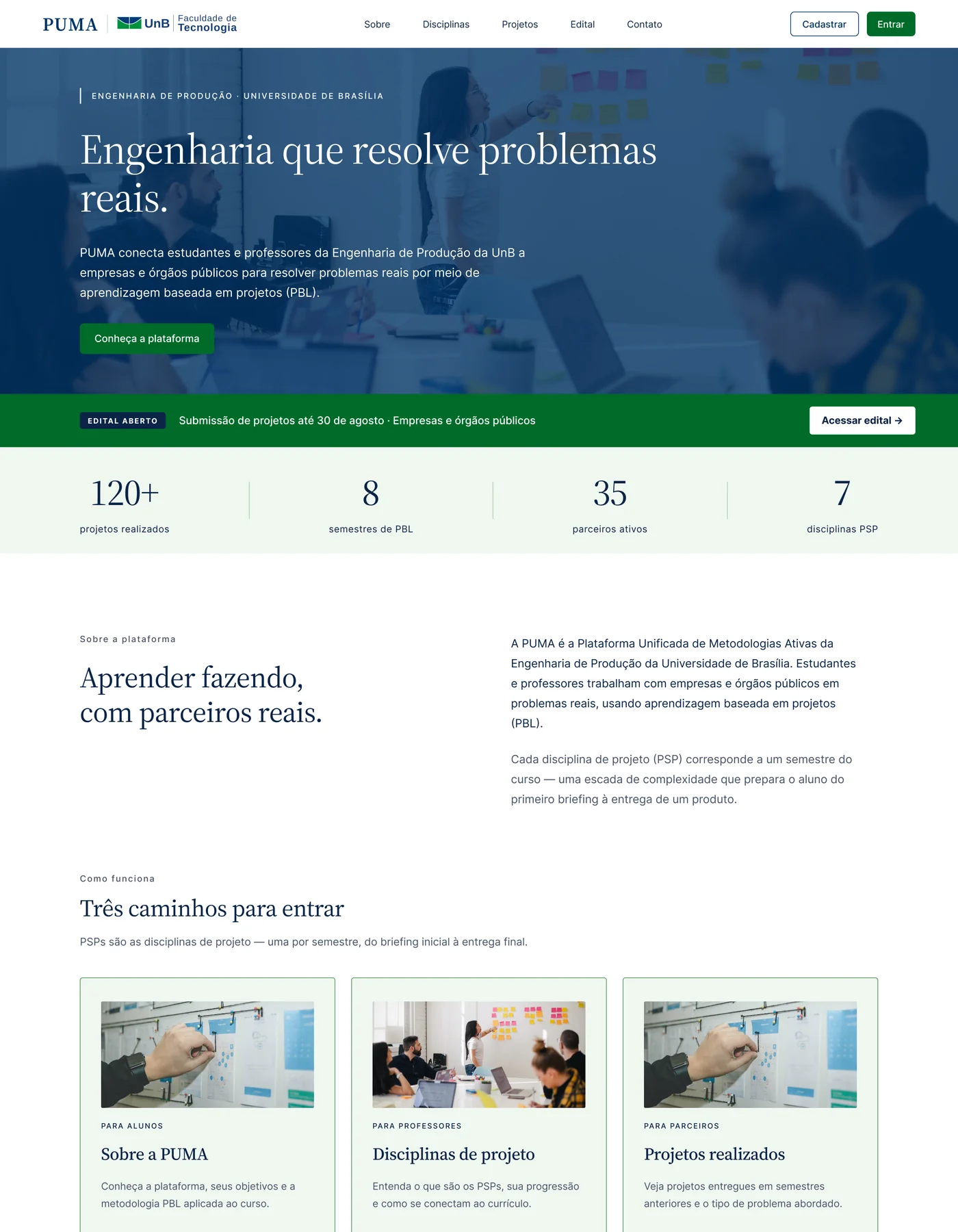
The public-facing surface existed only as requirements. I started by agreeing minimum acceptance criteria for each page with stakeholders and the dev team, written as user stories, then designed eight pages: homepage, about, disciplines, projects, project submission, contact, registration, and login. The pages read as editorial: alternating brand-blue, paper-green, and white bands, numbered section eyebrows borrowed from magazine layouts, and a single primary action per band.
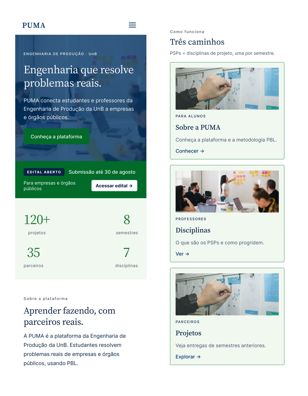
Then I adapted all eight for mobile, rethinking each layout rather than shrinking it. A sandwich menu, carousels to cut vertical scroll, single-column forms with large touch targets and inline validation, and copy shortened for a mobile reading context. Mobile was prioritised over desktop testing because Brazil’s internet access is overwhelmingly mobile.
The hardest page
Registration carried the most logic: a two-step flow that branches by user type (student, professor, individual agent, or company), each needing different identifiers. That branching is exactly where testing later found the most friction.
The final validation, across the whole flow
With the external environment built, the last step was to test the whole flow with users. I ran the interactive mobile prototype with two groups in separate rounds over Google Meet, screen-sharing from their own phones: five external agents (business owners) and four students and alumni. Each walked the full flow end-to-end, about thirty minutes a session.
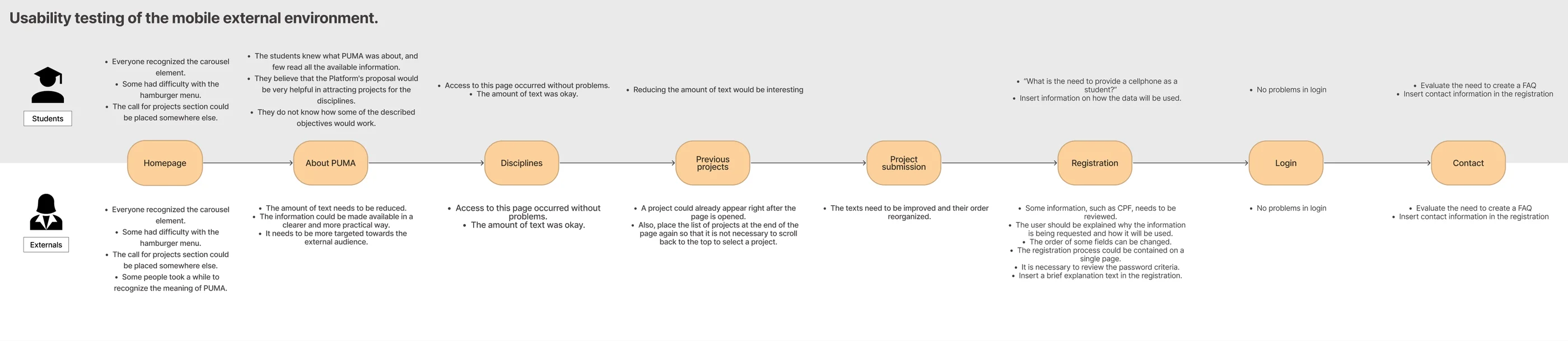
What external agents flagged
- Carousels were recognised by everyone; the sandwich menu tripped a few up, and the PUMA acronym took a moment to land.
- The "About" page read as too academic. It needed to speak to an outside audience in practical terms.
- Registration drew the most friction: the CPF field needed explaining, people questioned why each piece of data was required (an LGPD concern), and they wanted it on a single page.
- On Projects, the first project should be visible without scrolling, and the list repeated at the foot of the page.
What students flagged
- Students already knew PUMA, so they read little, but saw it as useful for finding projects.
- They questioned why a phone number was required and wanted data usage explained.
- "Too much text" again, on nearly every page: the clearest shared signal across both groups.
- Both groups asked for an FAQ and for contact details surfaced during registration.
Students and external agents arrive with completely different prior knowledge of PUMA, so the content has to serve the people who know it least: the external agents. Simpler content drove the biggest improvement.
What I delivered
- A functional architecture map: every module tied to the user who reaches it and its build state, adopted as the team’s shared reference.
- A redesigned discipline module: clearer forms, consistent edit and delete, and a safe delete flow, handed off to engineering.
- The full external environment, desktop and mobile: eight pages, interaction-ready in Figma, where before there was only a requirements list.
- Two rounds of mobile usability findings: five external agents and four students, documented for the next iteration.
- A content-strategy lesson: mobile and desktop need different content, not the same content in a smaller layout. A shift for a desktop-first team.
What I’d do differently
Run desktop and mobile in parallel
I designed desktop first, then mobile, in sequence. Mobile was where the real usability signal came from, and starting it earlier, in parallel, would have surfaced the content problems while there was still time to act on them.
Test low-fidelity first
I jumped to high-fidelity screens before testing structure. A round of wireframe testing would have caught the navigation and content issues earlier and cheaper, before I had invested in polished UI.
Treat content as a real deliverable
"Too much text" came back from every group, on every page. Co-design content with the flows and stakeholders from the start. Next time I’d treat content strategy as real work from day one.