Case Study · WS Audiology · 2023 to 2025
Bluetooth pairing flow
UX designer · iOS & Android · Bluetooth pairing, end to end
The Bluetooth pairing flow for medical-grade hearing aids, on iOS and Android. I designed the full decision tree end to end, including six error states and an accessibility pass with a blind participant. Connection drove more than half of all support calls, and the flow’s silence when something failed drove the drop-offs.
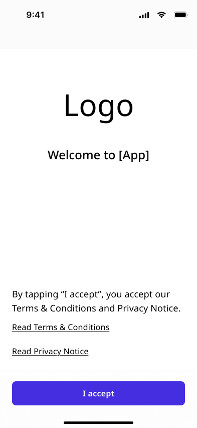
Bluetooth pairing is the first interaction a hearing aid user has with the app. It’s also where the most drop-offs happen. I designed the full decision-tree flow end-to-end: from welcome screen through device discovery, pairing, and error recovery, across iOS and Android.
WS Audiology is one of the largest hearing-aid manufacturers globally. Pairing is the gate to every other interaction in the companion apps that ship with these devices. Failures here turn into support calls and abandoned setups.
First experience with high failure rate
Bluetooth pairing for medical-grade hearing aids is not the same as pairing a speaker. Hearing aids have their own connection protocols and physical interaction patterns. Most users have low technology literacy and no prior experience pairing a Bluetooth device.
Support data confirmed it: connection drove more than half of all support calls and the highest abandonment point in the onboarding funnel.
I couldn’t change the hardware. Hearing aids would disappear from the Bluetooth scan without warning or report partial connections. The design had to account for every hardware state the firmware team told me was possible.
UX designer
Owned the design across all four iterations, working closely with product, engineering, and the audiological team.
- Flow architecture
- Screen design (iOS and Android)
- Interaction specs
- Component annotations
- Engineering handoff
- Accessibility QA
- Product and engineering teams
- Other designers (accessibility review and user testing)
- Audiological team (hardware behaviour and decision logic)
- Firmware engineers (error state mapping)
Same flow, completely different contexts
The same flow serves two different contexts:
What the research showed
We started with support data, then ran research sessions to understand why connection failed so often. The sessions showed the flow itself was sound. The gap was what happened when the hardware did not cooperate.
Findings
- HAWs had no mental model for re-pairing. First-time setup was handled at the clinic, but when the app crashed and they needed to pair again at home, there was no guidance and no recovery path.
- Every HCP participant had developed their own workaround: force-quitting the app, toggling Bluetooth manually, repeating the flow from scratch. None of these were supported by the design.
- When an error occurred, users couldn’t tell whether the problem was the app, the hearing aids, or their phone. No state-specific feedback meant no actionable next step.
The flow wasn’t confusing. It was silent when things went wrong. A linear flow with no branching assumed perfect hardware conditions.
A decision tree, not a linear flow
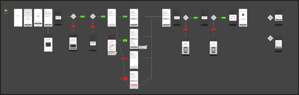
Full connection flow decision tree · Wireframes · Figma · Connection Workflow
A linear pairing flow only works when everything goes right. I structured the flow as a decision tree. At each node the app checks a condition and routes to the next step, so users never hit a dead end.
Two user types, one flow
The flow serves both HAWs and HCPs through the same screens. The design had to be clear and reassuring enough for someone who has never paired a Bluetooth device, while staying concise enough for someone doing it ten times a week.
Design decisions
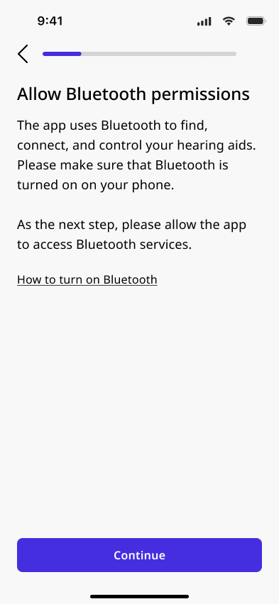
- Permission context before the OS prompt: A brief explanation before the system dialog reduced refusals and gave less technical users a reason to tap Allow.
- Visible scanning state: A loading indicator confirmed the phone was actively searching. Silence from the app reads as failure.
- Help that stays out of the way: 'Need more help?' opened an inline drawer without leaving the flow.
The flows couldn’t be identical. The permission model on Android required a denial-count state that iOS didn’t need, and the pairing dialog varies by device manufacturer on Android in a way iOS doesn’t. I maintained separate Figma pages for iOS and Android from iteration 1.
Hearing aid restart
Users had to manually restart their hearing aids before pairing by opening and closing the battery door, or placing the devices in the charging case for several seconds. Explaining a physical action in a UI required a restarting animation, not text alone.
Six error states
Each error state was mapped with firmware and product: what triggers it, what the app can detect, and what the user needs to do next. The rule throughout: every failure state defines a specific next step.
What the previous app taught the team
Before designing the new flow, we ran a structured accessibility evaluation of the existing app with a blind hearing aid user. The participant had been completely blind for 20 years, relied entirely on VoiceOver, and had stopped using the manufacturer app because it wasn’t accessible.
What we found
- Focus order was unpredictable: after completing a task, VoiceOver would jump to an unexpected element instead of starting from the top or the last confirmed step. The participant had to re-explore every new screen to reorient.
- Icons and images had no meaningful accessibility labels. A menu icon would be read as "burger", decorative images were announced as raw filenames, and interactive elements had no context for what they did.
- The participant was navigating entirely from memory and prior experience, not from what the design communicated.
What changed
- Focus order was annotated explicitly for every screen in Figma.
- I labeled every icon, image, and interactive element, and marked decorative ones to be ignored by screen readers.
"I know the app doesn’t work properly for me. But I’ve learned my way around it."
Participant · Blind hearing aid wearer
VoiceOver and TalkBack with real devices
After engineering shipped the new flow, I ran an internal QA pass using VoiceOver on iOS and TalkBack on Android, with hearing aids paired. Running a screen reader while managing a live pairing exposed issues design review had missed.
What I found
- Focus order in the scanning screen put the Cancel action before the status message, meaning VoiceOver users heard an actionable prompt before they understood what the app was doing.
- The animation playing while scanning had no accessible equivalent. Progress during pairing was communicated visually via a ring animation with no live region update.
- The restart-hearing-aids screen had its instructional text split across multiple elements that VoiceOver read in the wrong logical order. A user relying on the screen reader received fragmented instructions.
What changed
- I added ARIA live regions to the scanning and pairing states, so screen reader users hear status changes without navigating to them.
- I gave every animated state a static text equivalent and restructured the restart screen so VoiceOver reads the instruction as one unit.
What shipped
- Decision-tree flow shipped for iOS and Android: Covering HAW and HCP with platform-specific adaptations for permissions, back navigation, and pairing.
- Six error states, six recovery paths: No user path ends in a dead end. Every failure mode has a defined next step and a route back into the flow.
- Accessibility validated on real devices: Focus order, live regions, and screen reader read-order across all screens, run with hearing aid users on their own devices.
- Annotation system adopted team-wide: The VoiceOver and TalkBack approach established here became the WSA design team standard for accessibility handoff across all features.
The one thing I’d do differently
The accessibility evaluation happened in Iteration 3, after the core flow structure and error states were already built. The rework was significant enough to push the release date. One session with a screenreader user against early wireframes would have surfaced the focus order problems before they were baked into every screen. Accessibility changes what gets built from the start. Treating it as a final review step costs rework.