A Sudoku app built around learning. The client-side hint engine names the technique instead of filling in the answer. A technique library you can study on its own. A neobrutalist UI where colour does the teaching.
Built in React 19, TypeScript, and Vite. Runs entirely in the browser, with no backend involved. 12 engine patterns are live; 16 techniques are documented in the library.
Intermediate players plateau
They know naked singles and hidden singles. They never learn the rest, because the help they can reach spoils the puzzle. Every free Sudoku app treats players as ad inventory. Paid ones reveal answers instead of teaching. The coaching gap in the middle does not exist in any mainstream Sudoku product.
Tap a button, the app fills in the next cell. Fast, satisfying, and the only help available the moment you're stuck.
Nothing. The hint ends the puzzle instead of teaching the pattern that would survive into the next one.
Banner ads on a quarter of the screen. Interstitials between puzzles. "Watch a video to unlock a hint" gates.
That you are the inventory. The business model is engagement time, and the UI is engineered for it.
Open a tab, read about X-Wing on a static page, come back to a board that does not know what you just read.
The technique, in theory. Application stays unsolved. The grid never points at the pattern you just learned.
Three reference points
What to keep, what to leave behind. No user interviews, no surveys, no metrics. A one-week build doesn't earn that work yet.
The coaching is on the wrong surface. The design hasn't moved in a decade. The business is built against the player. None of the three references fix all three at once. That's the gap.
Five calls that shaped the product
Progressive reveal across three button taps, escalating from region to focus to answer.
One request returns one full payload. Technique name, region, reasoning, placement: all together.
Progressive reveal looks pedagogical but works like a slot machine. The player gets stuck once. The hint should carry the full explanation in a single response. "Get Another Hint" runs the engine on the new board state and returns the next independent step.
Clean, Material-leaning. Predictably accessible, predictably forgettable.
Neobrutalism. Thick black borders. Hard-offset shadows that never blur. Saturated accents on a yellow canvas.
The category is visually dead. Looking different keeps the product from blending in. Beyond that, the high-contrast palette does double duty for the pedagogy. Each colour maps to a hint role (orange = region scan, blue = chain logic, lime = placement, coral = error).
A brand-specific palette, internally consistent and externally meaningless.
Borrow the loot-rarity palette from games. Green = common (Easy). Blue = rare (Medium). Purple = epic (Hard). Orange = legendary (Expert).
Anyone who's played Hearthstone, TFT, Overwatch, or Borderlands reads the sequence without thinking. Expert puzzles feel earned because the colour already says 'legendary' to those players.
Server-side hint engine, with cleaner separation and swappable algorithms without shipping clients.
Client-side, in-process. TypeScript. Runs on the same board state the user is looking at.
Latency dominates the UX. A hint that takes 400ms over the wire is a different product from a hint that returns instantly. Privacy too: there's no good reason a Sudoku app should phone home with the in-progress board.
Accounts plus cross-device sync from day one, the standard "real product" expectation.
Local-first via localStorage. No accounts, no backend, no sync.
The proficiency state machine that would justify cross-device sync doesn't exist yet. Building accounts now would be infrastructure-for-infrastructure's-sake. Local-first is the right default until the thing being synced is itself worth syncing.
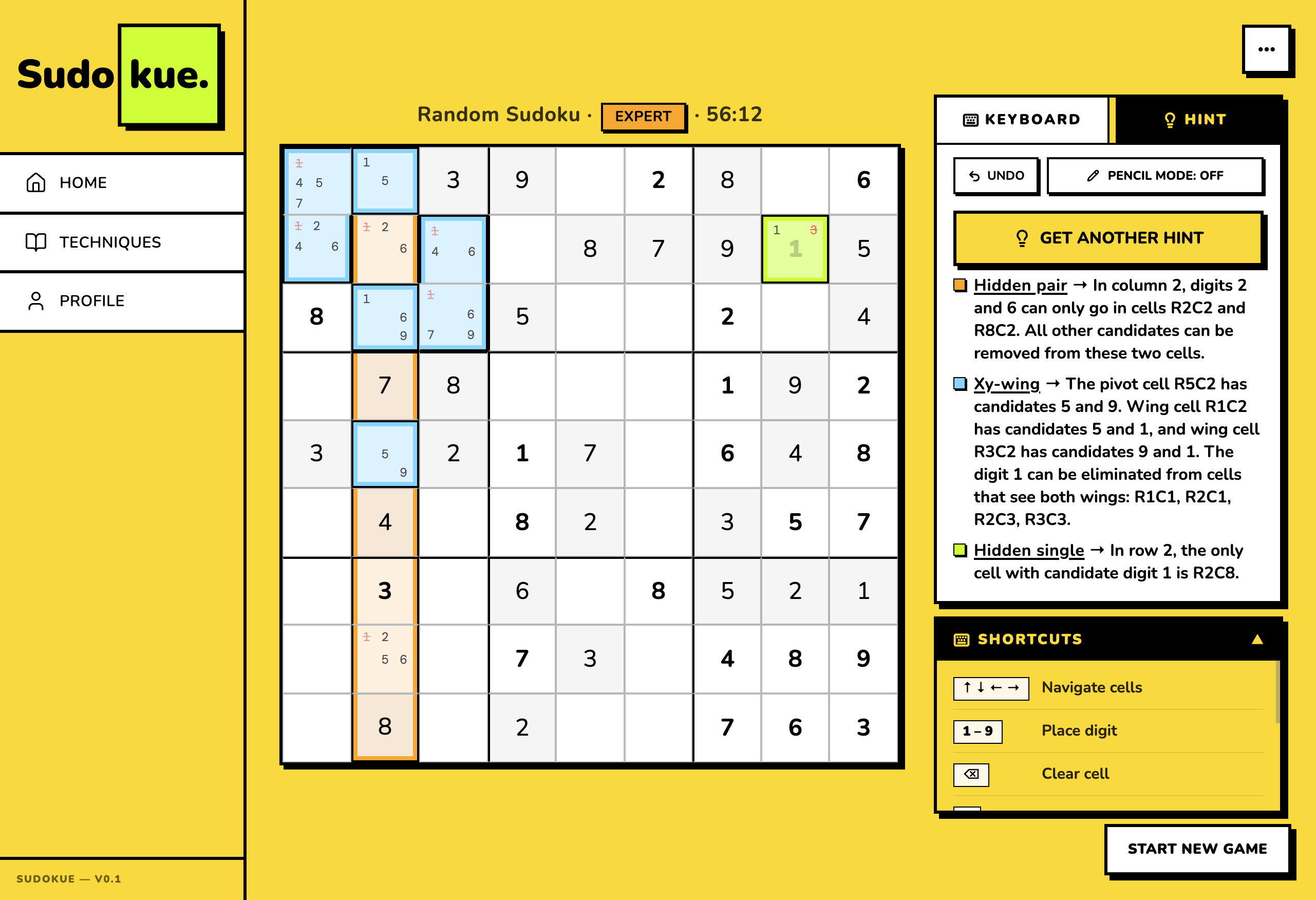
Hint quality is the product
One request returns one hint. Technique name, region, reasoning, and placement: all together. Each colour step is more assertive than the last: orange for the region scan, blue for the chain logic, lime for the placement commit.
Typical app
Just an answer dropped into R2C8. No technique named, no reasoning. The same pattern next puzzle finds you stuck again.
Sudokue
Three techniques chain to the same placement: The player sees the why, not just the what.
Engine architecture: one pass, one payload
Every hint follows the same path: board state in, technique match, payload out. The engine runs entirely client-side and is deterministic. Same board in, same hint out, every time.
81 cells with values, pencil marks, and candidates. The exact grid the player sees.
12 technique strategies run in order of complexity. First match wins. Each returns null or a partial payload.
Technique name, region cells, focus cells, placement cell, reasoning. One self-contained object the panel renders.
16 techniques. Three tiers
The engine currently returns 12 patterns. The four remaining advanced entries are library-only until the engine catches up. A player never requests a technique the engine can't prove. Solid chips are engine-backed; dashed are library-only.
Neobrutalism, on purpose
Thick black borders. Hard-offset shadows that never blur. Saturated accents on a yellow canvas. Nunito at weight 900 almost everywhere. Sharp corners, matching the grid.
The choice is pedagogical, not aesthetic. Colour helps players build associations. When colour carries meaning, you stop needing to explain it.
Mobile is the primary surface, since most Sudoku players solve on phones. The grid sits centred and dominant. The number pad docks below for thumb reach without occluding cells. The hint panel slides over the bottom half on demand, never above the grid. On desktop the same layout opens out: grid stays the focus, hint panel anchors right. One component handles both viewports. No separate mobile or desktop forks.
Touch targets stay at 44pt minimum even as the grid scales to fill the viewport. The number pad has its own input zone with large hit areas. The hint panel never overlaps the grid; it covers the keypad instead, since the keypad is what the player can spare while reading the hint.
.neo-card, .neo-btn, .neo-chip.Tokens carry the pedagogy
Three-tier tokens are the starting point. The interesting part is that hint.l1 / l2 / l3 and tier.beginner / intermediate / advanced exist as semantic tokens, not just hue aliases. The system doesn't know about lime or lilac in any meaningful sense. It knows what a region looks like and what a beginner technique looks like.
Raw hue, no opinion on usage.
Pedagogical role: the region nudge.
A specific cell state on the board.
The UI references the semantic token, never the primitive. Change a primitive once, every downstream reference updates. The visual language is derived from pedagogy, not picked from a swatch.
Hint levels, mapped end-to-end
Three semantic tiers. Each maps a primitive colour to a specific cell state on the board.
Source: src/tokens.ts. Storybook page renders these rows live, with hover states + token usage examples.
Component anatomy: one grid, four states
The same SudokuGrid component renders the empty board, the L1 placement target, the L2 chain step, and the L3 earlier-context cell. Each state pulls from a single component-tier token. No conditional CSS in JSX. No inline overrides.
-
DefaultEmpty cell, no state.
sudokuGrid.cellBg -
L1 targetThe placement cell: where the hint concludes.
sudokuGrid.cellTargetL1 -
L2 chainIntermediate step in the hint sequence.
sudokuGrid.cellTargetL2 -
L3 contextEarliest step: the technique's anchor.
sudokuGrid.cellTargetL3
Logged, not assumed
Every accessibility decision is recorded in docs/ACCESSIBILITY.md with date and reason. Accessibility drifts silently. A log with dates turns "we should have thought about this" into "we decided this on April 14th because of X."
In place
role="grid" with aria-label per cell including row, column, value or "empty".neo-btn: 3px black outline + 5px yellow halo, meets WCAG 1.4.11Not done yet
@storybook/addon-a11y installed but set to test: 'todo'. Needs a triage pass to flip to 'error'.How a solo designer ships in a week
Sudokue was designed and built by one person using Cursor and Claude Code as implementation partners. Not "AI-assisted" as a buzzword. AI as the second seat in the pair. Claude Code wrote production TypeScript while I wrote specs, made design decisions, and reviewed every diff.
Where AI accelerated
- Component scaffolding First-draft React components from a spec and a screenshot reference. I shaped the API; Claude filled in the implementation. 60–80% of the keystrokes weren't mine.
- Token audits Once the system was tabulated as data, asking "where does the success colour drift from the token?" became one regex + one read.
- Documentation surface area Each Storybook component page has 5 sections. Manually that's ~50 sections. With Claude as drafting partner: ~3 minutes per section, every page consistent.
- Refactors with breadth BoardDock extraction touched 340 lines across three breakpoint branches in a 1900-line file. Done in one session because the AI could hold the entire file in context.
- Accessibility wiring Focus traps, ARIA labels, keyboard maps: patterns I know but tedious to type. Faster to specify + verify than to write.
Where AI didn't help
- The bet "Each hint is one self-contained payload" is not a thing AI can decide for you. It comes from looking at three competitors, naming what they all miss, and pricing the exception.
- The loot-palette insight Borrowing Hearthstone's rarity palette requires having played those games and noticing the player would already read the sequence. AI doesn't have the lived context.
- What to cut Deciding to ship without OCR, without accounts, without dark mode: that's product judgment. AI defaults to building what you ask for.
- Voice and tone "GET HINT" not "CLICK HERE TO GET A HINT" is a taste call. AI will write either if you let it.
Three lessons that compound
In order of priority
- Real OCR in Scan flow. UI path is built, recognition is stubbed. Add the actual computer-vision step.
- Wire the proficiency state machine: ProficiencyMap renders demo data today. Replace with event-sourced transitions: not-seen → introduced → practiced → proficient.
- Hosted staging URL with a public beta cohort. Move from no metrics to actual usage data.
- Public beta: Close the loop on the proficiency hypothesis.
Designed, built and shipped solo in one week. 12 engine patterns. 16 techniques in the library. No ads, no accounts, no dark patterns. Live at sudokue.vercel.app ↗