Case Study · WS Audiology · 2023 to 2026
Multi-brand design system
Design System Lead · iOS & Android · Supported 5 teams, 14 brands & white label app

When WS Audiology set out to build a new hearing care app, engineering proposed reusing the skinning engine from the previous product, a code-only theming layer with no design counterpart. I pushed back and made the case for a proper token-based design system.
System designer
Sole system designer. Collaborated with feature designers, engineering, product, and brand teams across the full lifecycle.
What I owned
- Token architecture
- Theming system
- Component specs
- RTL layout rules
- Accessibility annotation system
- Engineering handoff
- QA
Who I worked with
- 5 engineering teams (iOS & Android native)
- Product and brand teams
- Token Studio to JSON to AzureDevOps pipeline (co-designed with engineering)
- Feature designers (component and token requests, scoping new additions to the system)
The accessibility annotation system I established was adopted by all 10 designers on the WSA design team.
A skinning engine with no design counterpart
The previous app had significant structural limitations. When the team decided to build a new app from scratch, engineering proposed reusing the skinning engine from the old product. The problem: the skinning engine only ran in code. There was no design counterpart.
That meant as designers, we had no way to see or address brand changes, or to understand how elements would interact with each other in different brand contexts. Engineering wanted to keep the skinning engine because it was already built. We said no.
The new app needed to support
The system had to be designed and built while features were already in flight. Architecture decisions couldn't wait for a clean start.
Three layers, one source of truth
Built in Token Studio. Each layer has a specific job, and the separation is what makes the whole thing composable across brands without touching components.
| Layer | What it holds | Example |
|---|---|---|
| 01 | Core Brand-namespaced. Maps literal values (e.g. #7000FF) to brand identity. |
brand.blue.500 |
| 02 | Semantic Intent-based names. Decoupled from any specific brand. |
semantic.bg.accent.default |
| 03 | Component Component-scoped decisions. Final consumption layer. |
button.filled.primary.bg.enabled |
Three layers of abstraction · Literal values, semantic intent, component usage · Brand changes never touch component code
Token Studio to code
Token Studio exported tokens as structured JSON, synced via AzureDevOps and consumed directly by iOS and Android native codebases. Design and engineering agreed on naming conventions, file structure, and the sync pipeline from the start.
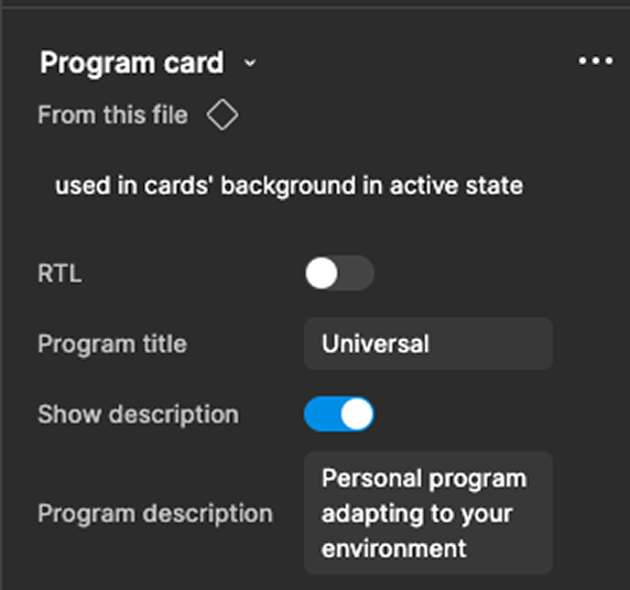
One component set supporting many brands
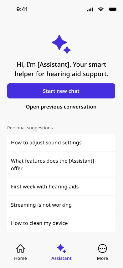
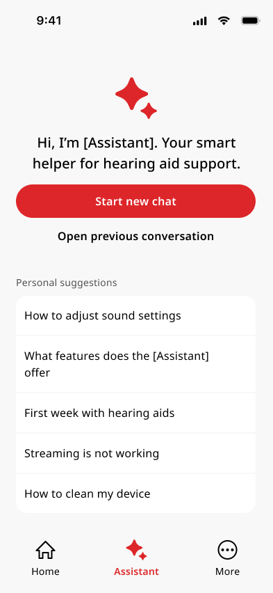
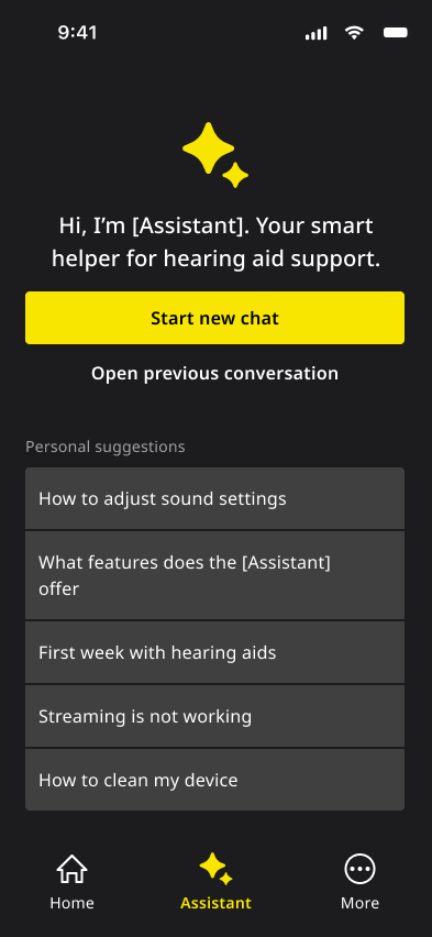
The system supports three tiers of brand specificity: main brands with full visual identities, private labels with brand colors and partial customisation, and a white label with no brand specificity at all. The same 25+ components render differently per brand, without duplicating component files.
| Token | Vanilla | Brand 1 | Brand 2 | Brand 3 |
|---|---|---|---|---|
| Primary color |
Blue
|
Red
|
Yellow
|
Teal
|
| Corner radius |
radius.2x · 8px
|
radius.999x · pill
|
radius.1x · 4px
|
radius.0x · 0px
|
| Typography | Noto Sans | Noto Sans | Noto Sans | Montserrat + Noto Sans |
| Mode | Light / Dark | Light / Dark | Dark only* | Light / Dark |
Same component set, four brand expressions · Primary color, corner radius and typography from token files alone
*Light mode was fully built in the system but not shipped, a brand decision, not a technical one. The token structure fully supports it; switching is a token file swap, not a redesign.
25+ components shipped to production
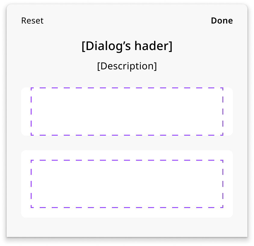
Every component connects directly to the component layer in the token system, specced with all states, properties, token annotations, iOS and Android variant notes, and VoiceOver and TalkBack read-order annotations.
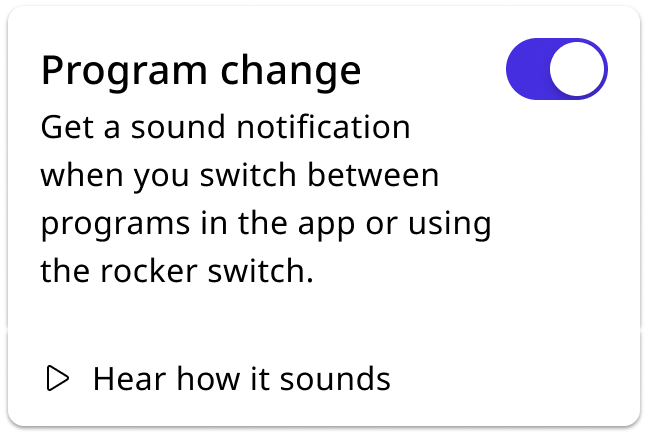
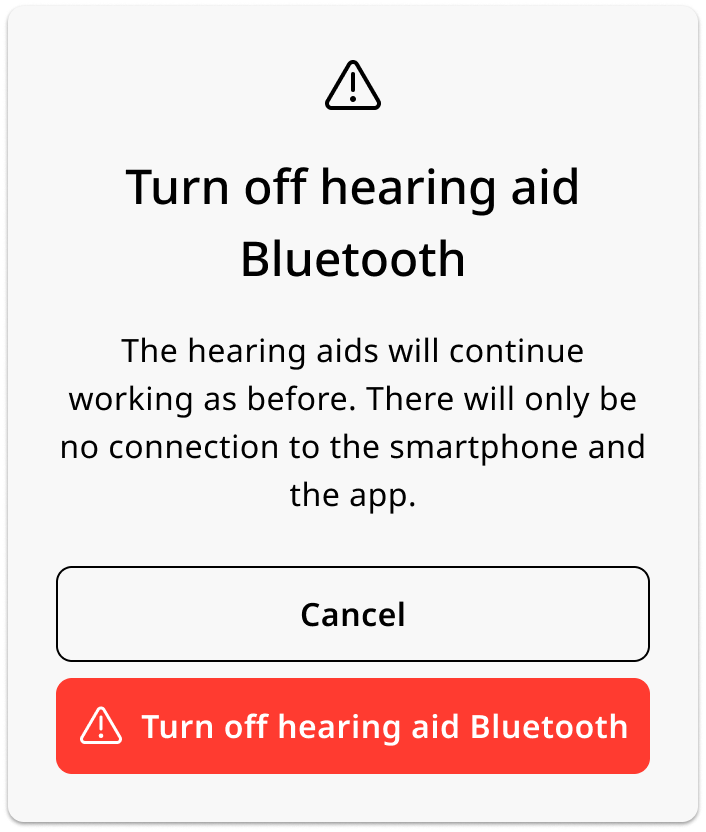
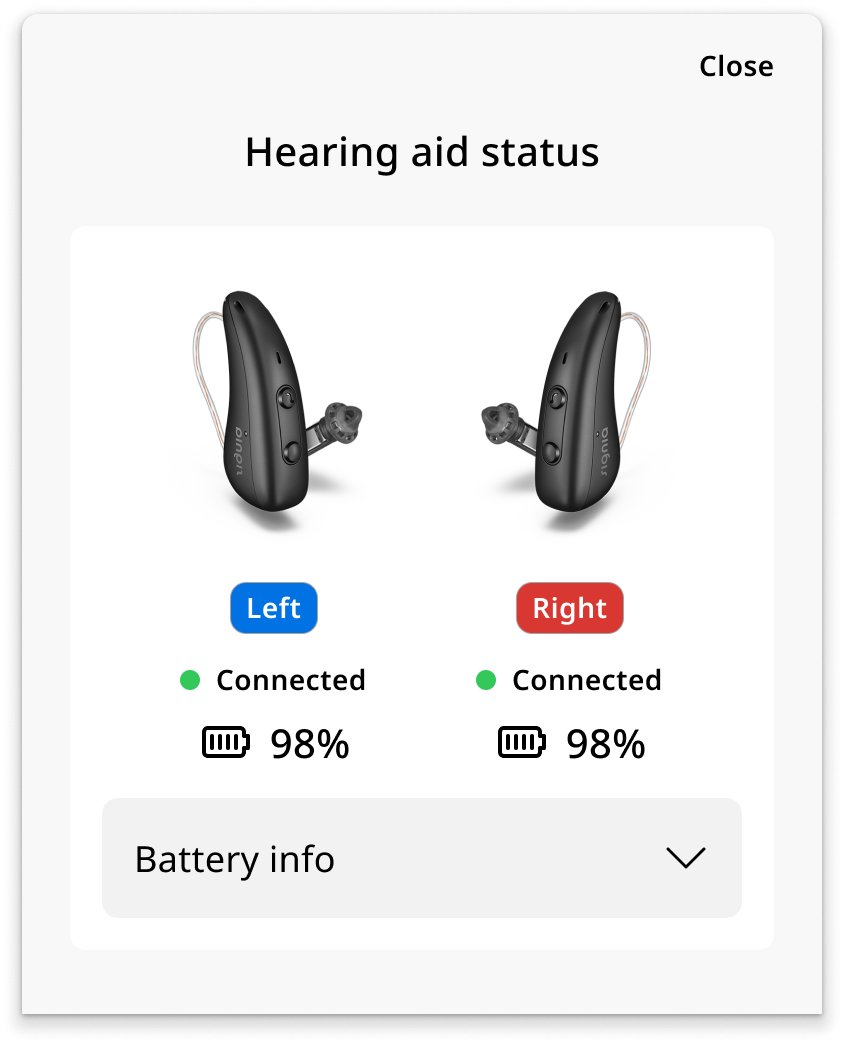
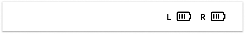
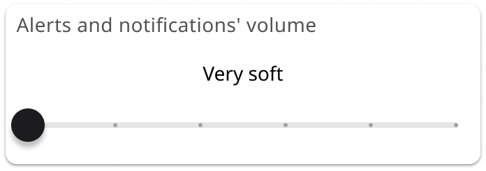
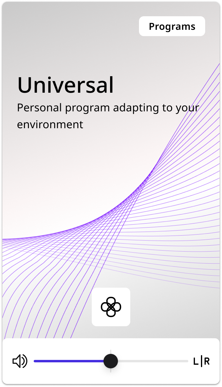
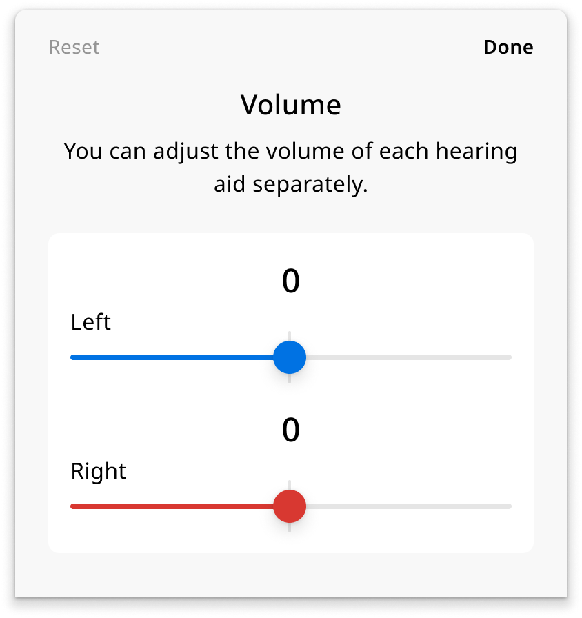
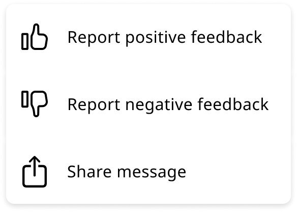
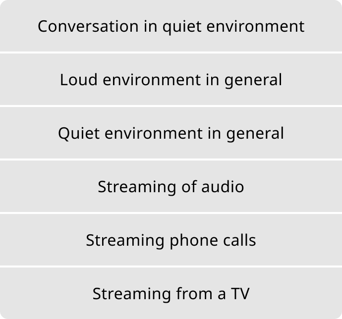
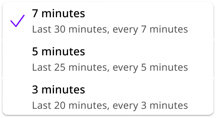
Components include: buttons, dialogs, bottom sheets, modal drawers, switch and toggle, volume sliders, equalizer controls, input fields, selection lists, country and language pickers, notifications, progress bars, loading states, tab bar with multi-brand icon variants, navigation bar, progress stepper, cards, chat bubbles, list items, and hearing aid status cards.
To name a few of the important ones:
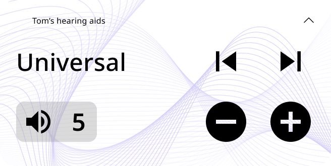

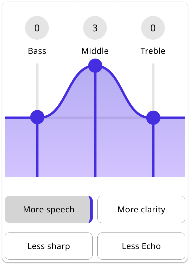
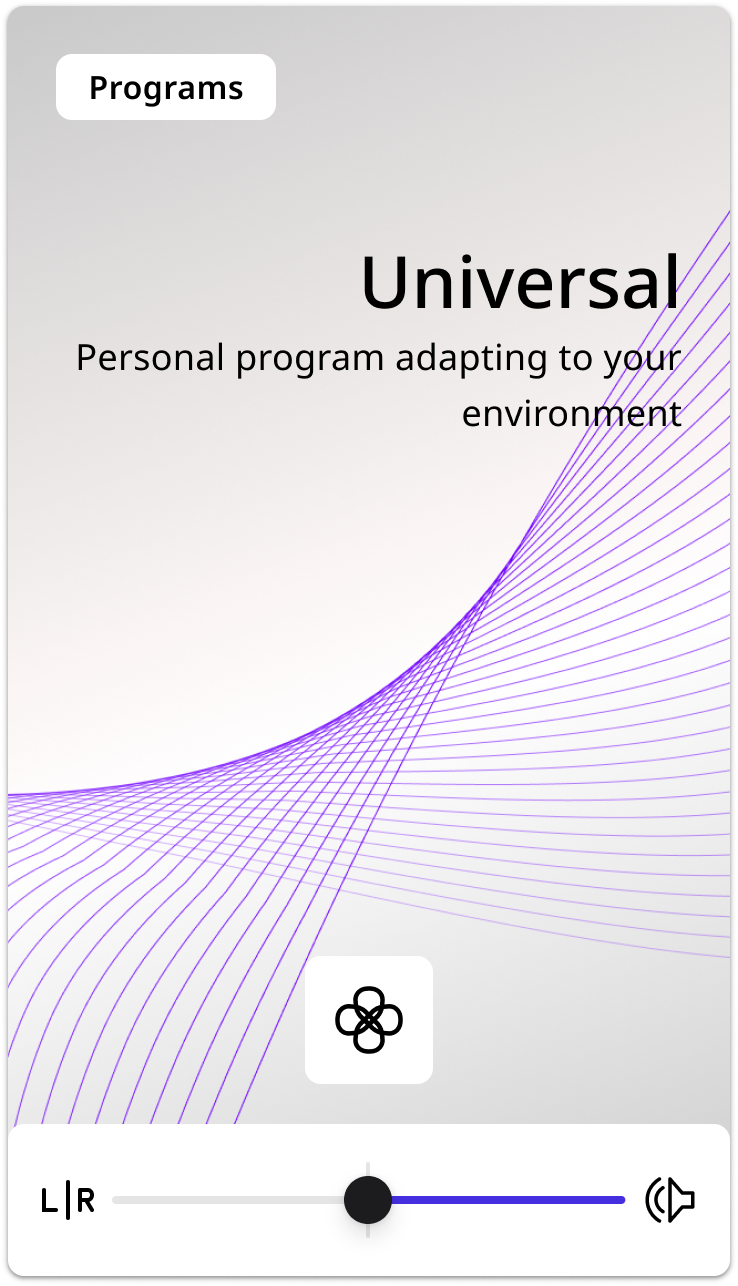
The design challenge was making audio tuning legible to someone who isn't an audiologist, while staying accurate enough that hearing care professionals would trust it.
The component needed to hold both the interactive EQ controls and the preset selector in a single unit, and remain composable enough to be slotted into the bottom sheet without breaking its internal layout across LTR and RTL.
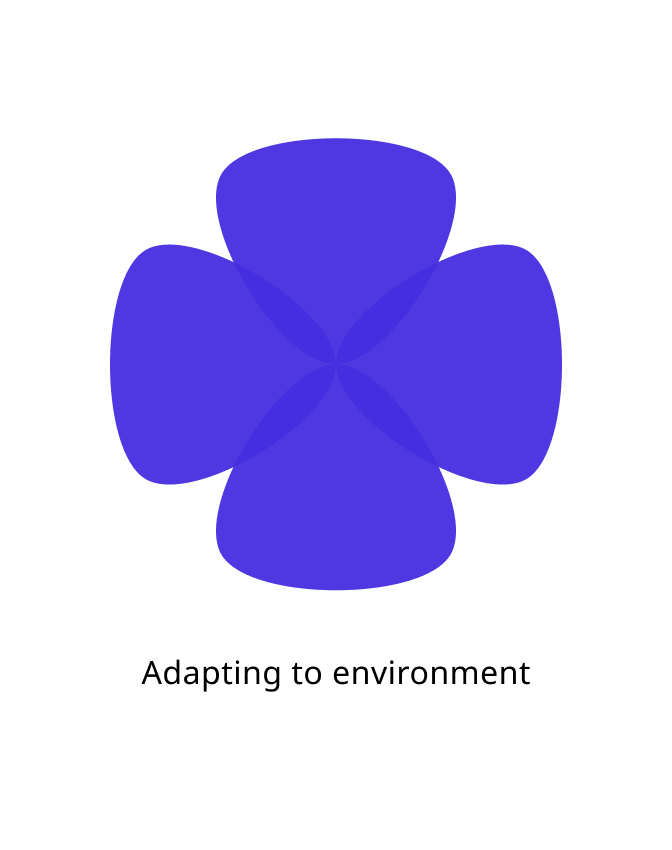
The component also had animation states: the wheel needed to transition between focus directions in a way that communicated spatial movement. Building animation into the component set meant defining every transition state as a discrete variant, so engineering had a clear spec for every keyframe rather than an implied interpolation. The range of positions, from concrete directions like Front and Back to abstract adaptive modes like None (Adapting), meant the visual design had to hold across very different semantic meanings without the icons losing meaning.
The bottom sheet is a shell: Sheet header, Content container, and Additional actions. The content container is a slot that accepts different content types as swappable component instances rather than duplicating the sheet for each use case.
This kept the bottom sheet as one maintained component instead of four diverging versions, and each slot became cleaner, more portable, and reusable in other contexts outside the sheet.
RTL support built in from day one
Arabic and Hebrew markets were in scope from day one, so:
- LTR and RTL states specced side-by-side as a single Figma component property
- Directional icons and language switcher positions flagged for mirroring
- String translation handled separately via the Phrase plugin, keeping layout logic and localisation decoupled
- Engineering received a single handoff artifact covering both directions, eliminating a separate design pass per feature

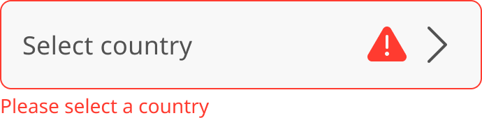
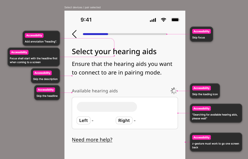
Accessibility built in
Our primary users are elderly people, often experiencing age-related hearing and vision loss, so accessibility was the baseline.
What was built in
- Color contrast verified at WCAG 2.1 across every component state
- Touch targets enforced at minimum 44×44pt
- No state relies on color alone: every state includes a secondary signal (icon, label, or pattern)
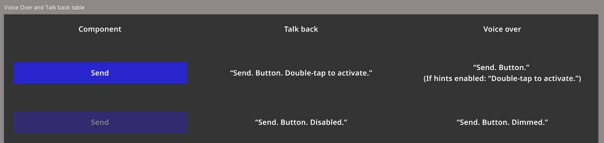
- Figma annotation layer for VoiceOver and TalkBack read-order, later adopted as the standard by all 10 designers on the WSA design team
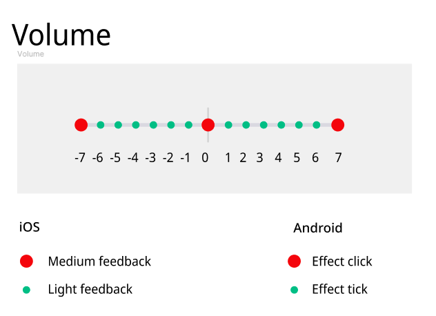
- Haptic feedback documented for iOS and Android in specified components
Delivered
- Token architecture delivered: Three-layer hierarchy built in Token Studio, consumed by 5 engineering teams on iOS and Android.
- 25+ components shipped: Buttons, dialogs, sliders, equalizers, chat elements, notifications, cards, all token-connected.
- Multi-brand support: Single token structure for 3 main brands, 10+ private labels, and a white label app.
- RTL and multilanguage support. Implemented directly inside component properties.
- Reduced handoff overhead: Engineering teams could understand component behaviour and intent without dedicated handoff sessions.
- Consistency across features: Components had a single look and feel across the entire product.
- Annotation system adopted team-wide: VoiceOver and TalkBack read-order approach adopted by all 10 designers on the WSA design team.
- WCAG compliance by default. Accessibility built into components and inherited by features automatically.
What I'd do differently
Earlier engineering alignment on token naming
The naming structure I defined was logical from a design perspective, but engineering teams had their own conventions for variable naming in iOS and Android codebases. Agreeing on naming conventions earlier would have cut the rework when engineering mapped them to iOS and Android variable names.
A living documentation layer from the start
As the system grew, new contributors needed onboarding material. A Figma page or external site surfacing token values, usage examples, and do/don't guidelines per component should have been built from the start.
A design system is a communication tool. The token architecture mattered because it gave designers, engineers, and product teams a shared language for decisions that would otherwise vary by feature.