Case Study · Caixa Econômica Federal · 2020 · Academic concept
Personal Finance Management
Sole designer · Research-led personal-finance app for Brazil’s Caixa · From discovery through hi-fi prototype
A speculative redesign of Caixa Econômica Federal’s app, scoped to goal-saving. Solo capstone from app-store review mining and 100 survey responses through a hi-fi prototype, validated with two rounds of usability testing.
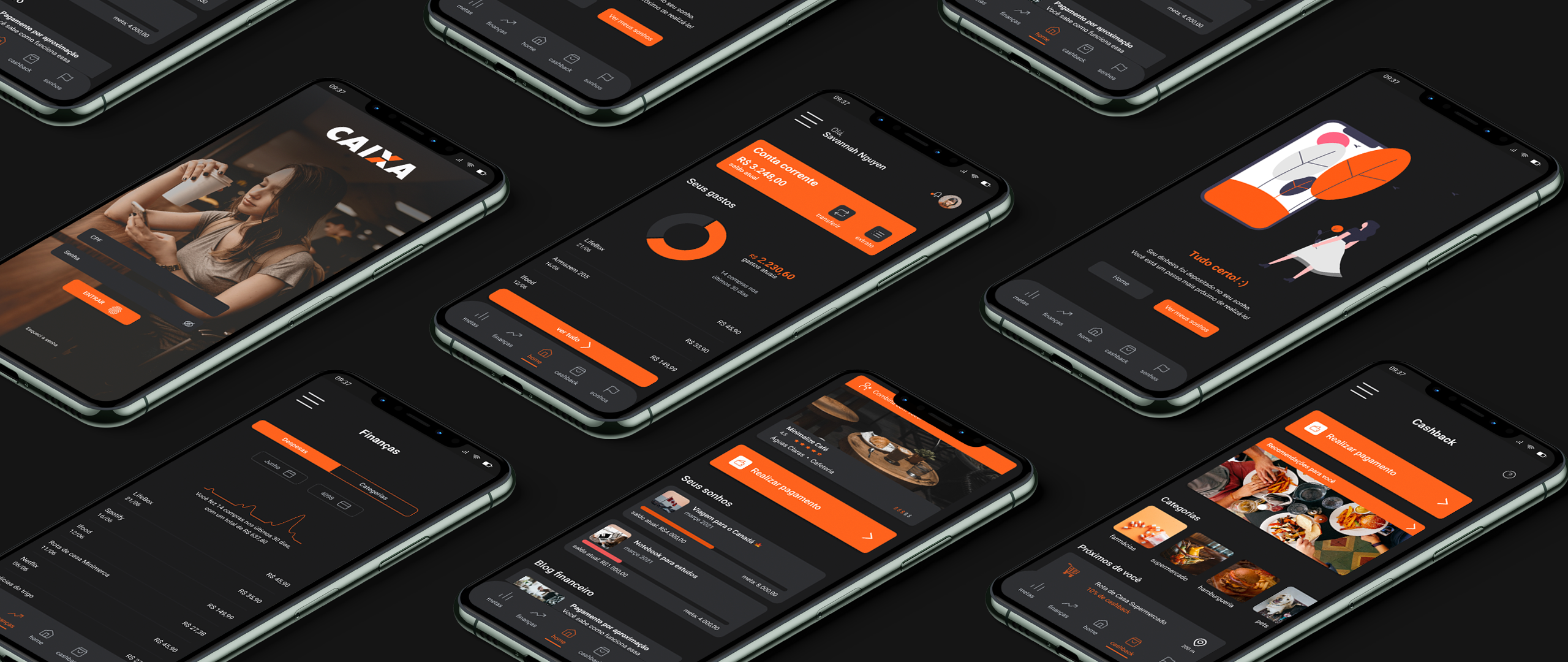
Centred on the one job the evidence kept surfacing: helping people save. Taken end-to-end during the 2020 lockdown.
Caixa was not a client. I picked it because pandemic-era load made the app’s failure modes visible to every Brazilian at once. The new surface centres on saving toward goals (called Sonhos in the product), spending guidance, and short financial-literacy content.
A bank people already hate to use
In 2020 the federal government routed pandemic emergency aid (auxílio emergencial) to tens of millions of unemployed and informal workers, and Caixa was the bank chosen to pay it. Overnight, people who had never touched a banking app were forced into one to reach money they urgently needed. The app buckled: crashes, failed logins, screens nobody could navigate, and a flood of one-star reviews on top of an app that already crashed on a balance check. The agency queues made the news every week. The App Store reviews became a public ledger of failure. That setup was the brief.
Caixa’s app rated 2.x stars on both stores. I pulled both review corpora (App Store and Google Play, August 2020), tagged each entry by theme, and ran a frequency analysis. Both stores said the same thing: the app doesn’t work, and users don’t trust it to do the basics.
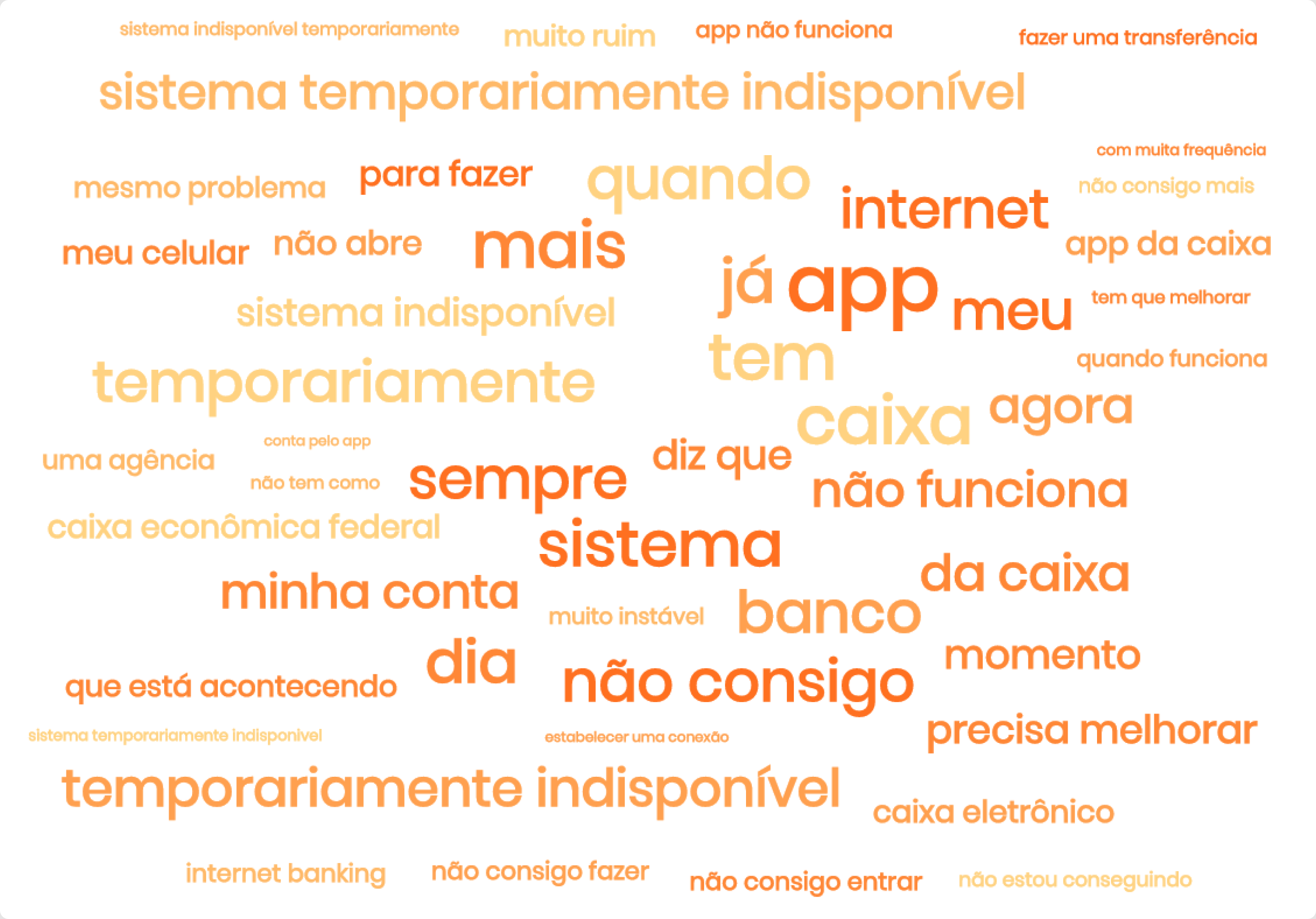
Strip the neutral nouns and the most-frequent phrases read like a list of usability defects: "temporarily unavailable" ("temporariamente indisponível"), "system unavailable" ("sistema indisponível"), "doesn’t work" ("não funciona"), "I can’t" ("não consigo"), "won’t open" ("não abre").
That ruled out one direction: stacking features onto the existing app was the wrong move. A separate, smaller app scoped to saving made more sense. The legacy app keeps the transactions, and the failure modes Caixa would have to fix anyway.
Why this case
Two more reasons it was worth picking, beyond the public failure.
Sole designer, every stage
A self-directed bootcamp capstone (UX Unicórnio 1.0). No client, no team. The bootcamp critique loop was the only sounding board.
What I owned
- Problem framing and project objective
- App-store review mining and synthesis
- User interviews, surveys, and a CSD matrix iterated five times
- Persona, journey map, prioritisation
- Paper sketches, lo-fi, hi-fi, and a small visual system
- Two rounds of usability testing and the rework that followed
What was outside the room
- No business stakeholder. Caixa was not a client
- No development partner. The prototype was never built
- No production telemetry. Outcomes are concept-level, not measured
- No access to internal data. The review corpus came from the public stores
Evidence from four streams
No client meant no budget, no participant panel, no incentive pool. Research came from what I could reach.
Inputs
- App-store review mining: the full public review corpus on iOS and Play, scraped and tagged by theme, charted into three wordclouds and five quantitative breakdowns
- Two interviews: active Caixa account holders, semi-structured, around 45 minutes each. Verbatim notes kept
- One survey: 100 responses on banking-app satisfaction, financial-management methods, cashback and miles usage
- CSD matrix, five iterations: what was known (certezas), assumed (suposições), and still open (dúvidas), re-sorted each time new evidence came in
What changed my framing
- Heavy users don’t trust the app even when it works. The habit of going to the agency persists
- Brand bias is real and shows up before any screen loads. One usability tester opened the home and said "Is it Caixa? I already hate it." ("É da Caixa? Já odeio")
- Users already track their money, in spreadsheets or on paper. The market didn’t need another tracker. It needed less friction
- Cashback distrust runs deep. Most interviewees had been burned by a code-activation scam, which set the bar for any reward system in the new app
- Fintechs are on the rise
- Traditional banks lag behind on tech and innovate far less than fintechs
- Financial education helps people save
- Discounts alone push people to spend
- Some people end the month in the black but aren’t sure where the money went
- People manage their finances in apps more than on pen and paper
- Users struggle with the Caixa app
- People check their spending fairly regularly
- Most of the bank’s account holders use the mobile app
- Few people consume financial-education content
- People look online for product and service recommendations
- What makes Caixa’s main app hard to use?
- How can users see their spending history?
- How do people try to pay less for what they buy?
CSD matrix · Final iteration · Separates validated facts from assumptions that needed testing
One persona, deliberately not the heaviest pain
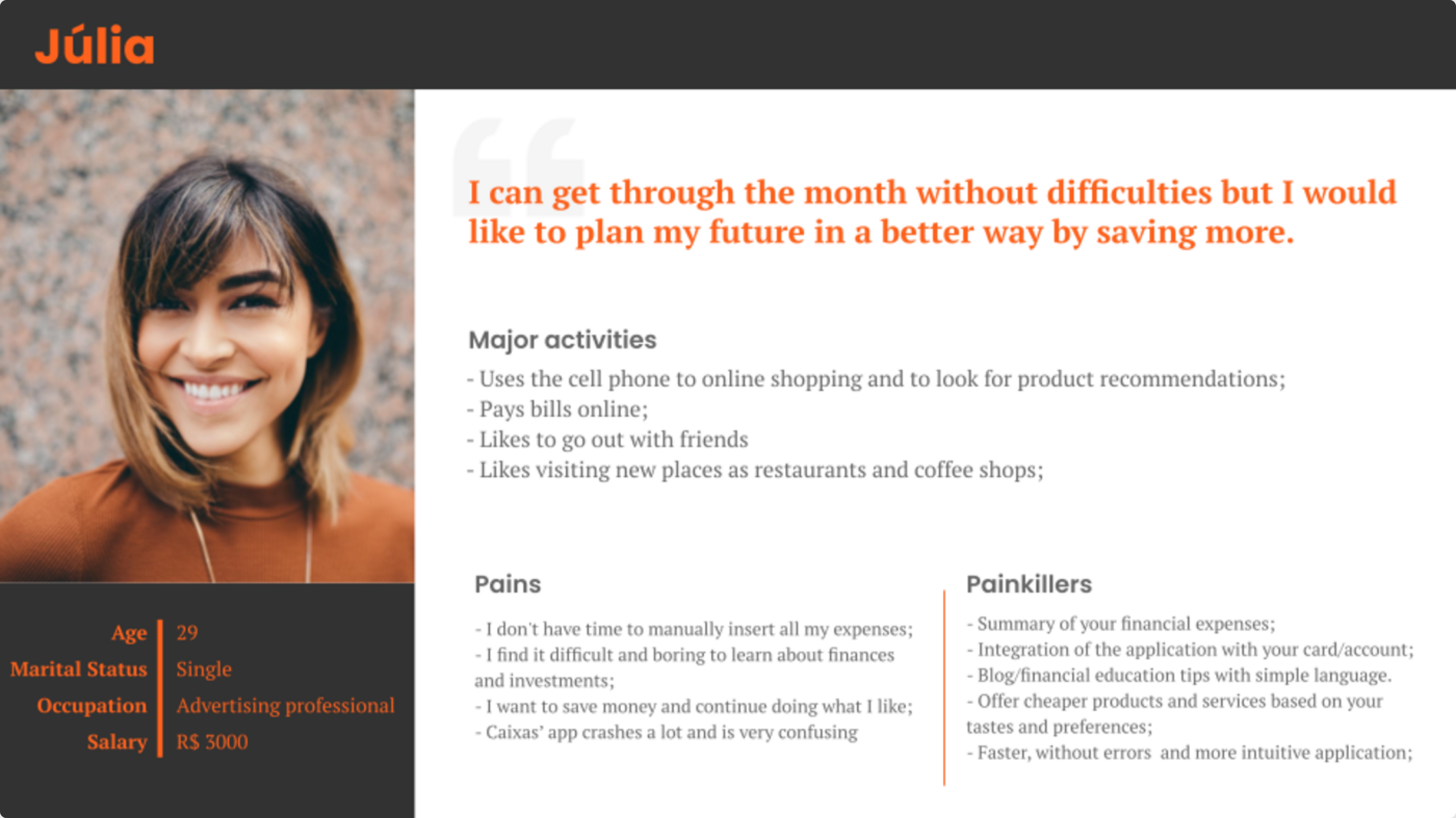
I started with two protopersonas. After the interviews, the second one collapsed into the first. Picking Júlia over a higher-pain persona raised the bar on the brief: there was no "broken" to fix, only friction to remove and behaviour to nudge.
From "I should save" to "I did"
The opportunities row is the synthesis: the moves I carried into the build.
- Gets paid, checks her statement
- Pays the month’s bills
- Searches apps, videos and tips
- Weighs the options
- Asks friends for recommendations
- Tests the app
- Starts planning and tracking spending
- Plans the months ahead
- Follows the app’s savings tips
- Buys from partners to earn cashback
- Reads up on finances
- Keeps checking she’s on track
- Watches the savings add up
- Hits her goals (trips, courses)
- Eyes the next one
- “I need to save more for my trip”
- “I overspent on food this month”
- “Does Maria use this app?”
- “Can I keep going out and still save?”
- “I hope this works”
- “I hope I can actually save”
- “I’m actually saving”
- “McDonald’s has good cashback, I’ll go”
- “I’m taking better care of my money”
- “I’ve saved a lot lately”
- “I pulled it off. Now, Europe”
- Uncertainty
- Doubt
- Drive to improve
- Insecurity
- Doubt
- Hope
- Apprehension
- Confidence
- Initiative
- Optimism
- Pride
- Motivation
- Happiness
- Pride
- Confidence
- Offer ways to save and help reaching goals
- The bank’s own app: convenience, speed, security
- Simple, clear language
- Cashback on partner purchases
- Help her set spending goals
- Centralise her finances
- Recommend places from her spending
- Financial blog
- Surface progress so she stays on track
- Bring in new partners
- Offer the next investment step
- Seek new partners
What made the MVP
An impact × effort 2×2 to keep the scope honest. Everything outside the sweet spot was parked, cut, or named as a v2 idea, so it wouldn’t creep into the MVP.
Shipped to the prototype
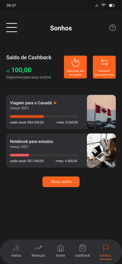
- Sonhos: goal-saving as the home surface, with progress bars and CDB-backed yield underneath
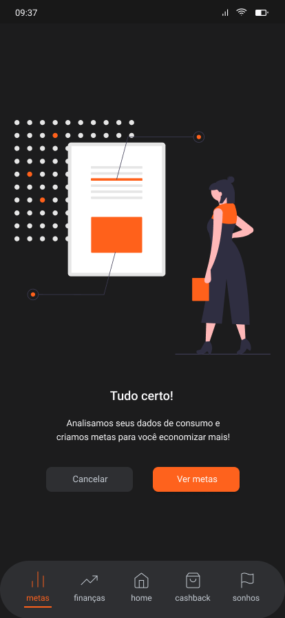
- Assistente Financeiro: AI-suggested per-category spending targets, derived from the last six months of activity
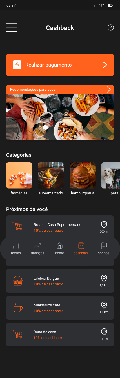
- Cashback: earned at partner stores, routed into a Sonho the user picks. A 7-day window before unassigned cashback falls back to balance
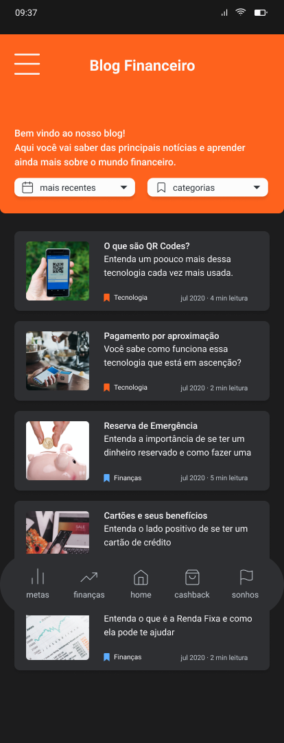
- Blog Financeiro: short literacy content in plain language, with reading-time tags
- Account score: earned through saving consistency, unlocks tariff perks. Never advertised. Only earned.
Paper first, on purpose
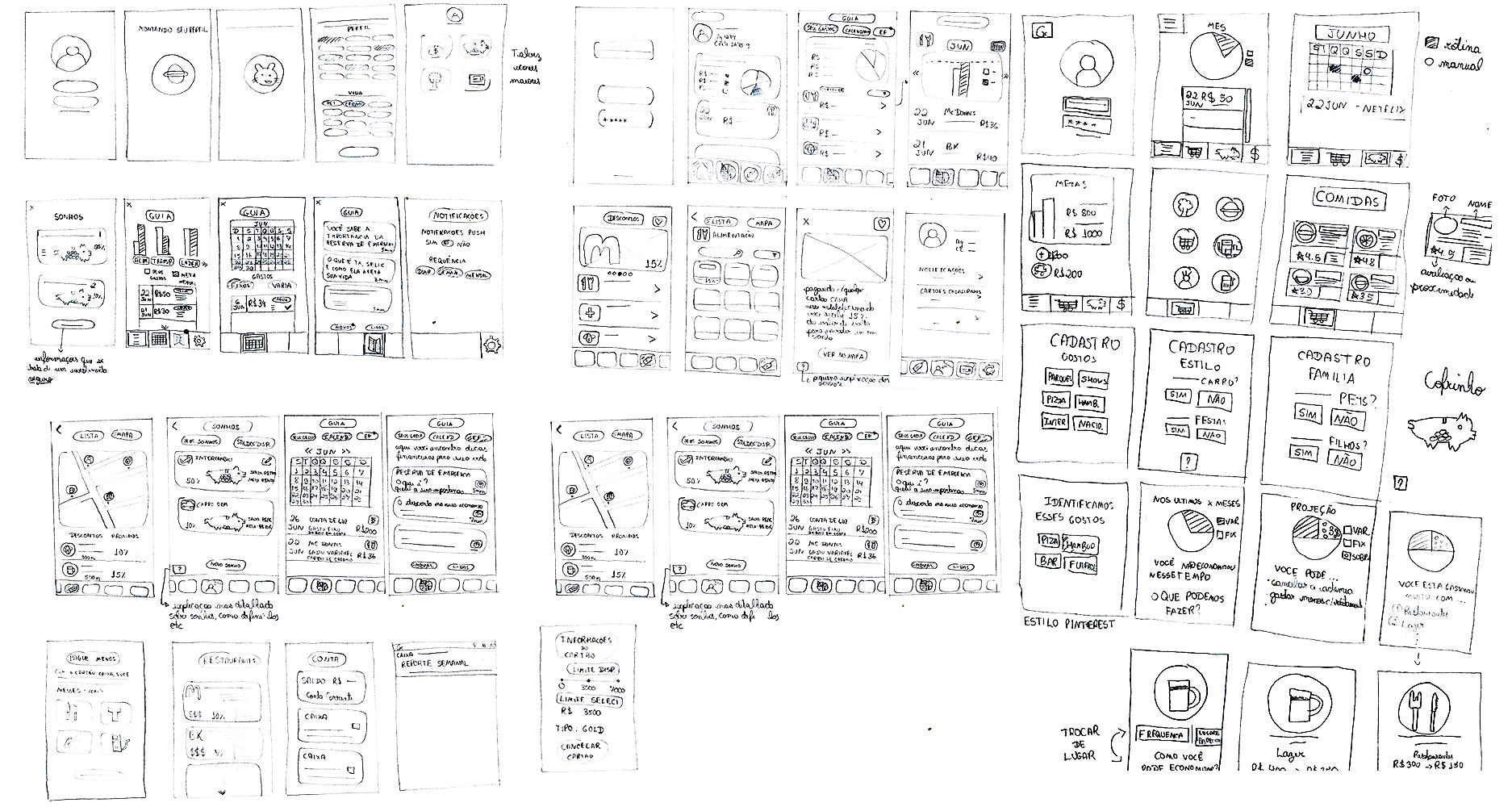
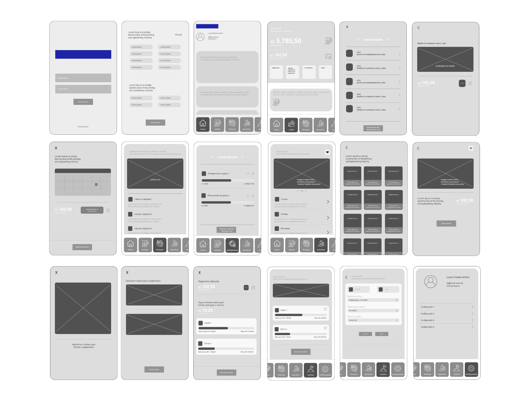
Roughly 30 screens on paper before Figma opened. The home layout went through four paper versions I’d otherwise have built in Figma and grown attached to.
Brand orange, claimed properly
The visual system pulled the primary colour from Caixa’s existing brand orange. Two reasons: it keeps the work recognisably Caixa, and the legacy app uses orange sparingly and badly. Claiming it as the CTA colour made the brand feel intentional instead of incidental.
An earlier iteration leaned on a blue/orange split closer to Caixa’s full logo. Dropping the blue cleaned the system up and made the CTA orange unambiguous.
Colour
Three primaries (brand orange plus a lighter and darker variant), a five-step neutral ramp, and exactly two feedback colours, one error and one success. Anything more would have been decoration.
Typography
Roboto, picked for neutrality. Five heading levels, two paragraph weights, one small caption. The smallest scale that could hold the IA without compromise. H1 sits on the home Sonhos header. Everything underneath tunes for scanability.
Buttons
Three roles, four states each. CTA stays reserved for orange: the moment the user is supposed to act. Secondary handles "not yet" branches. Primary handles inline confirms inside flows. Disabled never relies on colour alone; the contrast is structural too.
This is not a production design system. It’s a project-scoped foundation, sized to keep the prototype consistent and its visual decisions defensible. A grown-up version would add motion, density modes, and proper accessibility tokens. That wasn’t the scope here.
Sonhos replaces transactions as the home
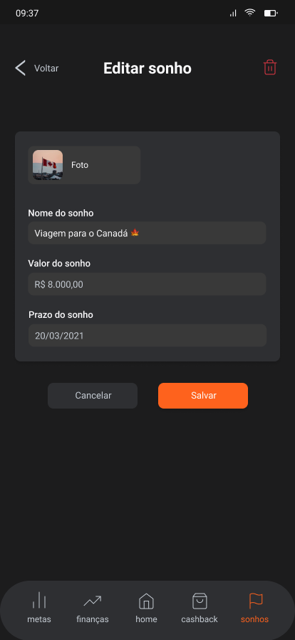
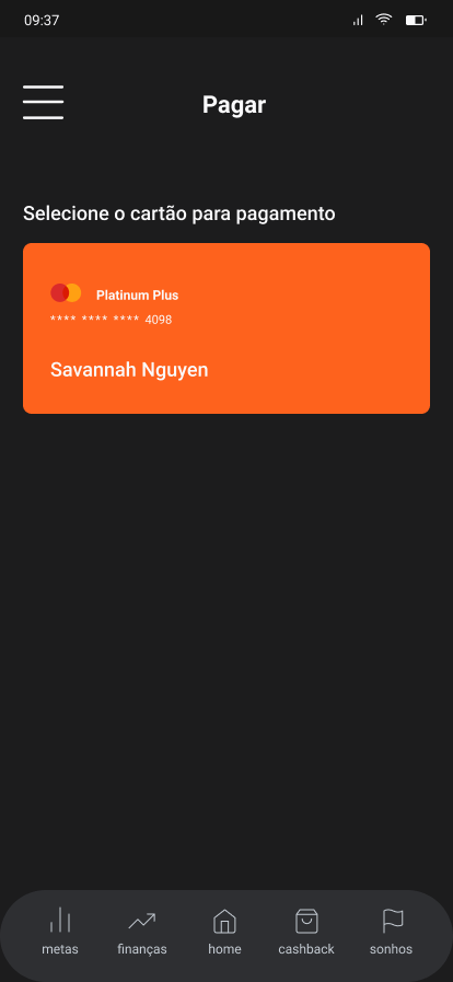
The hi-fi prototype centres on goal-saving. The home tab is goals (Sonhos), not payments (Pagamento). Each goal is a CDB-backed savings target with a progress bar, an estimated yield, and the next-best action surfaced inline. The other tabs are second-class by intent. They support the saving job rather than compete with it.
Interface in Brazilian Portuguese; captions translated.
What broke, what changed
Two rounds, more than six participants between them. Verbatim notes for every session. I paired each finding with a concrete design change; findings that didn’t lead to one stayed on the open-questions list instead of quietly disappearing.
Written in 2020, still holds
After shipping the prototype I logged a self-critique while the project was still fresh. Rereading it years later, almost every item is still right. They’re listed below as I wrote them, lightly translated.
Reframe the project objective as a problem statement
"50% of users save 30% in three months" was a wish, not a measurable outcome. A fair target for a prototype is whether participants understand each screen and would open it twice. I’d cut the wish-target on day one.
Drop the temporal axis from the journey
My journey is structured chronologically by app stage. It should be structured by experience: what the user is trying to accomplish at each step, regardless of where in the product they are. Map experience, not app surface.
Accessibility
I validated the dark theme and hot orange against brand match, not against WCAG contrast at every body-text size. Touch targets, focus states, screen-reader labels and motion-reduce behaviour didn’t make it into the design-system spec. A few surfaces (the cashback partner cards, the meta-text on Sonho rows) almost certainly fail AA on dark backgrounds.
There was also no support for text enhancement: the design assumed one fixed type size, with no honouring of the OS text-size setting, no Dynamic Type, and no sane minimum body size. Anyone who scaled their system font up (exactly the older or low-vision users a public bank has to serve) would have broken the layout. Today that’s table stakes, and something I’d build in from the first screen.
A production version would treat accessibility as a token-level requirement, not a polish step. Contrast pairs would live inside the colour token. Focus rings would be a primitive. Type would scale with the user’s system setting and reflow without clipping or truncation. Screen-reader semantics would get specified per component, before any screen is composed.
Push financial education earlier
The Blog Financeiro tab arrived late in the build and stayed at sketch-level depth. The research signal was clear that financial literacy mattered as much as tracking. I’d treat it as a peer feature, not a side panel.
What still applies
This was the first project I owned end-to-end. The research depth was disproportionate to the deliverable: six weeks of discovery against four weeks of design. For a concept where the brand itself was the biggest unknown, that ratio was the right call.
Real complaints beat invented personas
The store-review wordcloud did more strategic work in a day than any persona I wrote that month. When public evidence exists, mine it first. It forces the problem statement to defend itself against real language instead of synthesised pain.
Bias is a designed surface
"I already hate it" ("Já odeio") was design feedback. No screen-level fix could undo the brand-bias finding. Putting it in the case rather than burying it is part of the work.