Case Study · WS Audiology · 2023
RTApps Figma Library
Owned the Figma library · Sketch-to-Figma migration, atomic design, auto-layout, documentation
The RTApps Figma component library behind Signia’s hearing-aid apps, migrated from Sketch. I rebuilt every component and screen on real library instances, with an atomic structure and documentation. One change to a component then propagated to every screen that used it, and the app it powered won a UX Design Award in 2023.
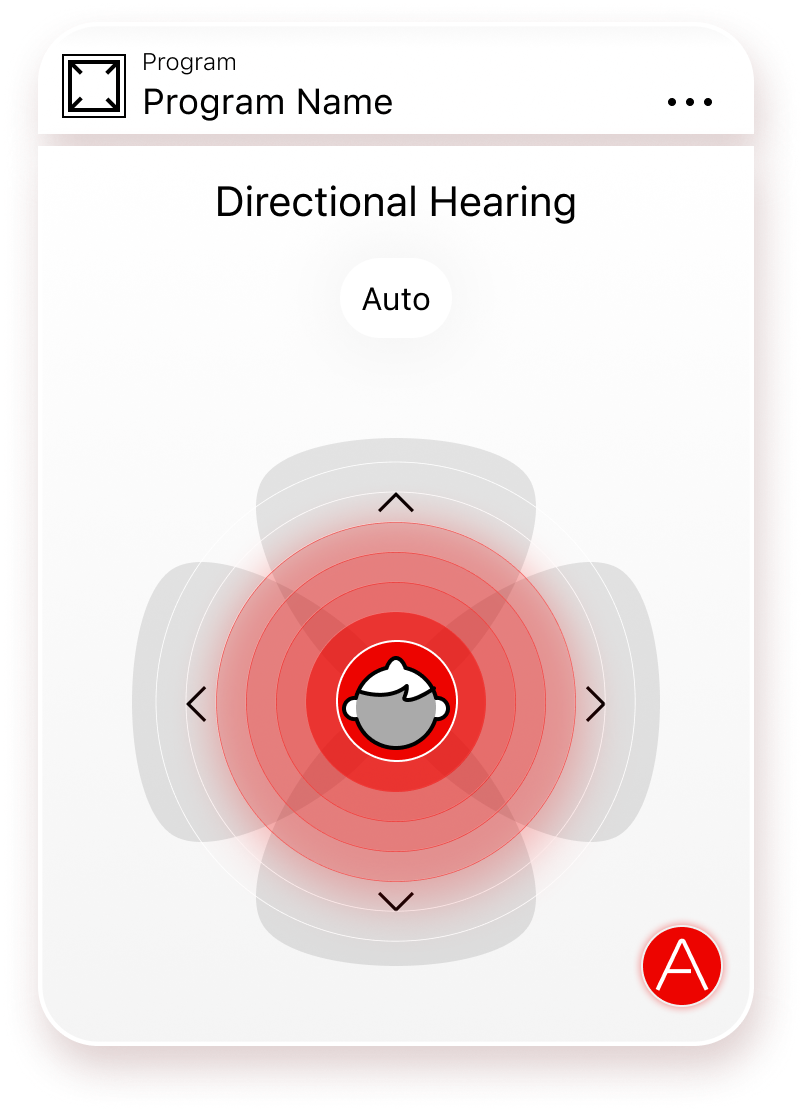

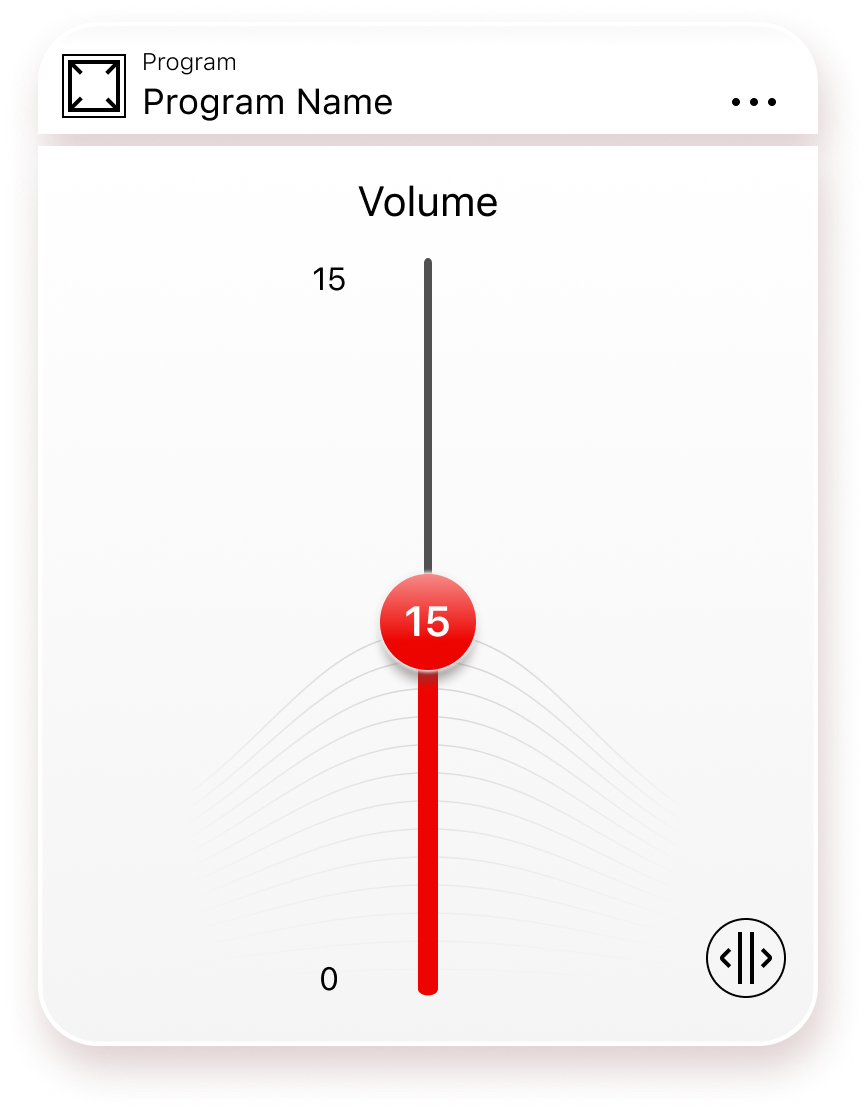
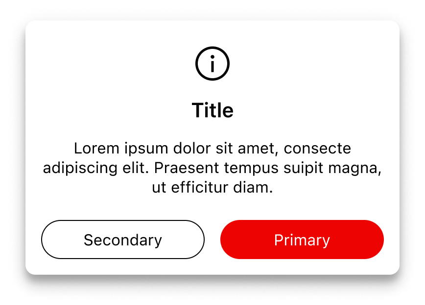
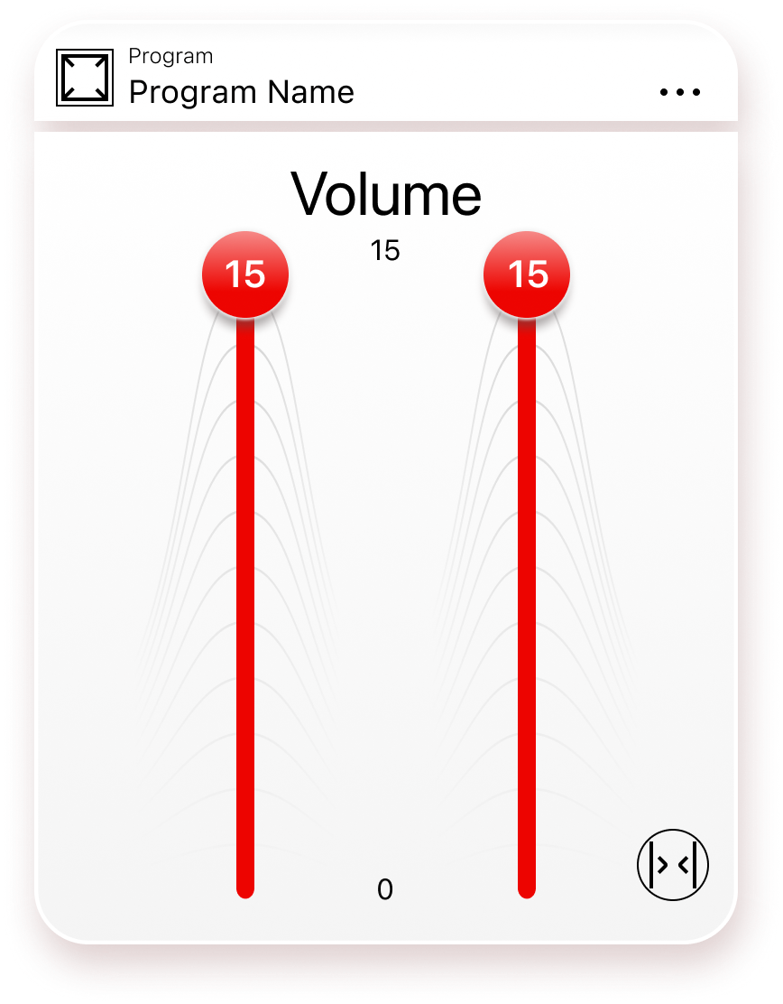
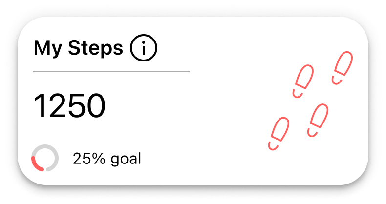

RTApps is the WS Audiology platform that powers the companion mobile apps for the group’s hearing aids. One product, many brands. I owned the Figma component library that turns that platform into pixels: I led its migration off Sketch, rebuilt it under atomic design with auto-layout from the ground up, and shipped the documentation conventions every designer on the team now follows.
When I joined WS Audiology, the source of truth was a Sketch library that had grown past the point of being usable. Components had drifted, overrides were inconsistent, naming was tribal knowledge, and resizing anything by hand cost an hour. Engineering and the brand-app teams were starting to fork off their own variants because the central library could not keep up. The migration to Figma was the moment to fix the file, not translate it.
The brand spinoffs the library carried
Signia is the flagship. Five sister brands were themed from the same component set: Rexton, TruHearing, Audibene, HearCom, AudioService, with private-label apps on top of that. Each brand kept its own wordmark, palette and surface choices; the components underneath stayed shared.

A Sketch library at the end of its rope
The pre-migration file wasn’t broken, just out of road. Sketch symbols had no real responsiveness; every screen size meant a duplicated symbol. Overrides did not nest deeply enough for a multi-brand library, so the same component existed three or four times with different colours baked in. The naming was carrying years of legacy, and the only person who could navigate the file confidently was the person who built it.
At the same time, the platform was scaling. Signia was the flagship, but the same RTApps engine had to skin into sister brands and private labels, each with its own visual identity. Without a library that could absorb that variance, every brand-app designer was about to fork the file. The work I needed to enable, multi-brand theming, was structurally impossible on the existing setup.
Sketch symbols could resize, but not relayout. Every breakpoint meant duplicated symbols. One source of truth, only on paper.
Colour and type variants were duplicated per brand instead of derived. Adding a brand meant copying the file and editing every symbol by hand.
Legacy names from earlier app versions sat next to current ones. New designers could not tell which was the one to use without asking.
Brand-app designers were copying components into their own files to fix what the library could not. The central library was on its way to becoming a reference, not the source.
I owned the library, end to end
I was the designer who carried the file. From the migration plan and the atomic structure to every component’s auto-layout setup and the documentation pages everyone reads on day one. The library is consumed by the designers shipping each brand’s companion app.
- The full Sketch-to-Figma migration of the library file
- The atomic structure: atoms, molecules, organisms, templates
- Every component’s auto-layout and resizing behaviour
- The variant matrix per component · state, size, brand
- The documentation pages, naming, and contribution rules
- Library publishing and the consumption pattern across the brand apps
- WSA brand-app designers consuming the library
- Product stakeholders · release planning and scope
- Engineering · matching component behaviour to the implementation
RTApps and the Signia App later won the UX Design Awards 2023, in the Medical Software category. The library was the source every screen in that award entry came from.
Sketch out, Figma in
The cheap option was to import the Sketch file into Figma and call it done. I argued for the expensive one: rebuild every component natively, on Figma’s terms, so we could finally use what Sketch had been missing. Auto-layout, variants, nested components, and proper publishing. The migration was the rare chance to fix the structure under cover of a tooling change.
Symbol-based, fragile
- Symbols with overrides, no relayout
- Per-breakpoint duplicate symbols
- Colour baked into the component
- Branch-and-merge via Abstract, slow
- One owner who held the map
Component-based, responsive
- Components with variants for state, size, brand
- Auto-layout doing the relayout work
- Theme tokens consumed via styles and variables
- Branching native to the file, fast
- Documentation pages so the file teaches itself
How I sequenced it
I didn’t rebuild everything before opening it to the team. The migration ran as overlapping phases, so the brand-app designers were never without a working library.
Atoms, molecules, organisms
I used atomic design because it gave the library a shared vocabulary across designers and a clean rule for where any new piece belongs. Templates and pages live outside the library, in the brand-app files.
Single-purpose, single-state, no internal structure. The pieces every higher tier composes from. Change an atom and the whole library updates.
An icon plus a label plus a state ring is a button. A label plus an input plus a help line is a field. Built from atoms, exposing variants for state, size, and brand.
Discrete chunks of an app: a hearing-aid status card, a program list, a tab bar, a bottom sheet, a full dialog. The pieces that change the way a screen reads as a whole.
Atoms in the file
The foundation pages publish the atoms every component composes from: the type scale and the colour system. Text styles ship per platform, iOS and Android in parallel, each a real copyable style rather than a value to eyeball.
Palette · what the screen carries
Auto-layout on every component
Sketch's missing piece was relayout. Figma's auto-layout is the lever that turned the library responsive: a single component can stretch, hug, fill, and re-wrap based on its content and the frame it lives in. I built it in from the start. No component shipped without auto-layout, so the brand apps could drop the same instance into an iPhone SE and a 6.7″ canvas and have it behave.
Every frame in the library uses one of three sizing rules. Hug to content, fill the container, or hold a fixed dimension when a control needs to.
Horizontal for inline composition, vertical for stacked. Direction is set by what the component is, not by what fits today’s screen.
Components were drawn against the 360 px Android grid first, then stretched up to 414 px iOS. The grid page in the library documents both, so the same component fits the smallest target without breaking the larger one.
A button at width 320 and a button at width 390 is one component, not two. That single rule killed half the file.
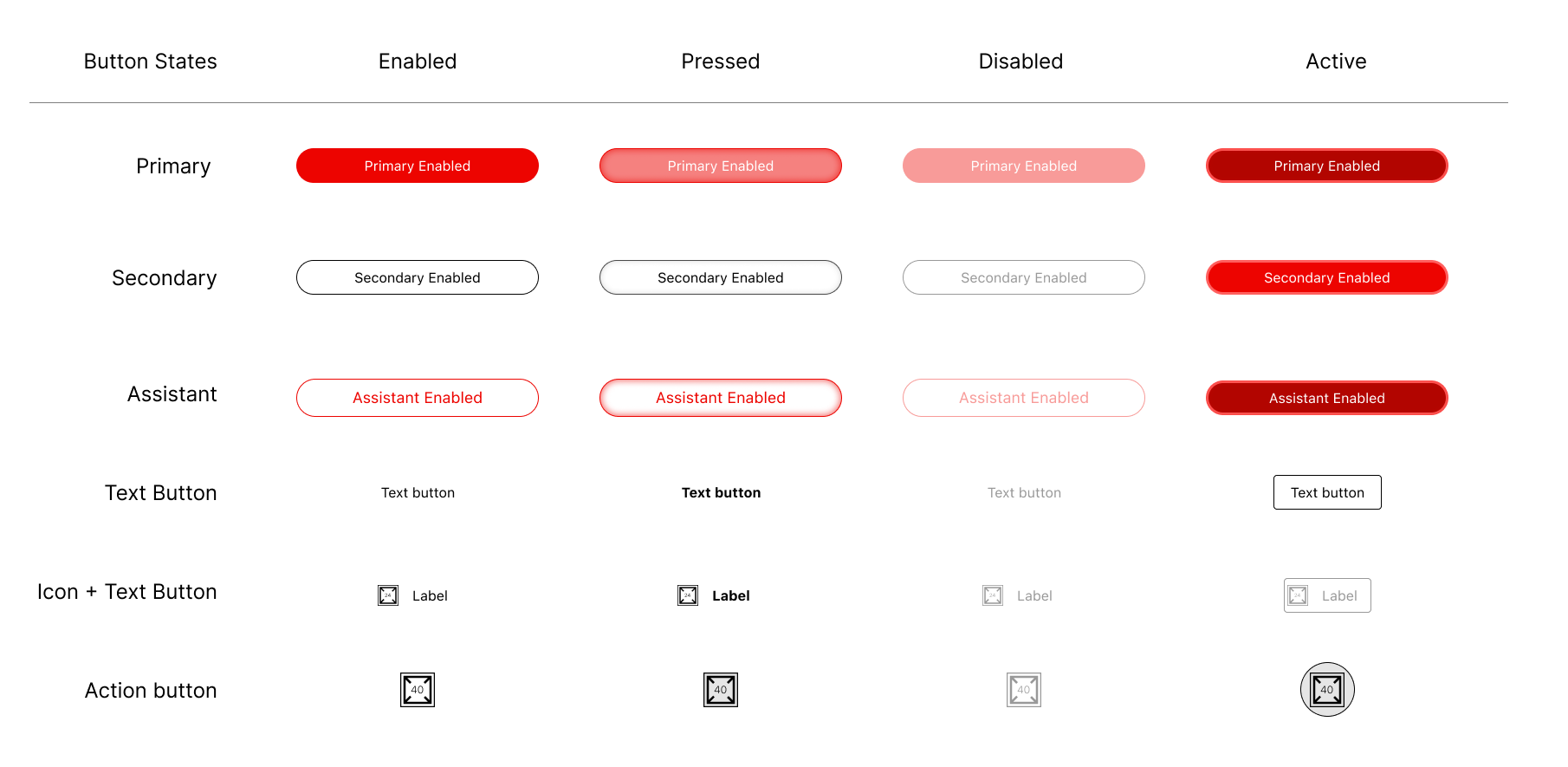
State (default/hover/pressed/disabled), size (sm/md/lg where it matters), and brand (Signia and sister labels) live as variants on the component, not as separate components.
Components never assume the canvas. They assume the parent frame. That is what lets the same component live in an iPhone, a tablet sketch, or a marketing mock.
One component, every brand
Same components, themed across the brands the platform supports. The variant matrix carries state and size; the brand swap is a Color Style change at the root. The library does not duplicate per brand. It themes.

Where the library themed, and where it forked
Most components themed cleanly: same anatomy, brand-specific Color Styles, no structural change. A small set of organisms could not. Rexton ships its own Assist module: tutorial cards, illustration components, retry flow, onboarding list. These were brand-specific by design, so they lived as their own page in the library, alongside Signia’s. One library, two assistants, documented as such.

What the library ships
The library covers the surface area the brand apps use. Every component listed below is auto-layout enabled, has the full state matrix, and themes across the brands the platform supports.
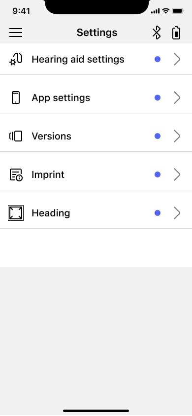
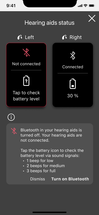
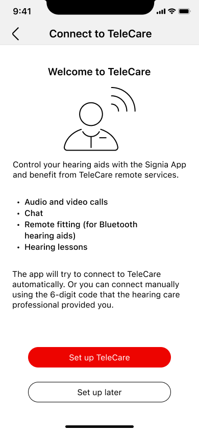
In the wild · the Signia App consuming the library
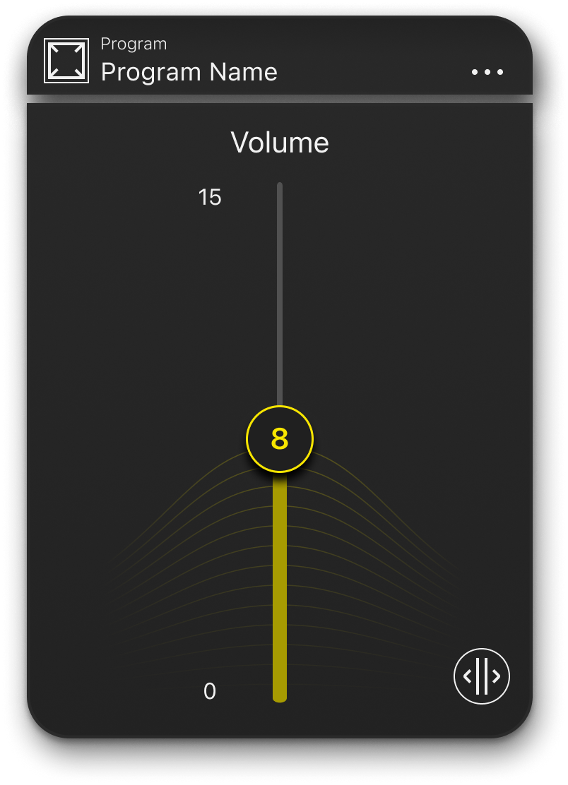
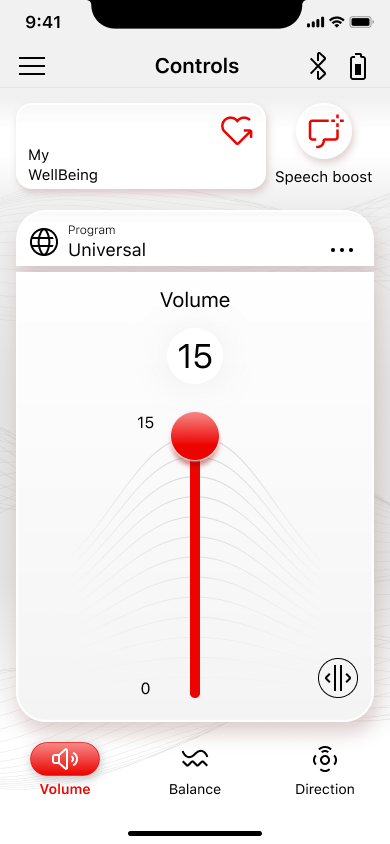
Every element on every screen below is a library instance. The volume slider, the list rows, the status pills, the buttons, the navigation: nothing is local to the app file. Change the library, change every screen.
A library that teaches itself
A library nobody can navigate is a library nobody uses. I built the documentation in the file, not next to it, so the answer to “how do I use this component?” is one page-jump away from the component itself. Each page is in the same Figma file, kept current as the library evolves.
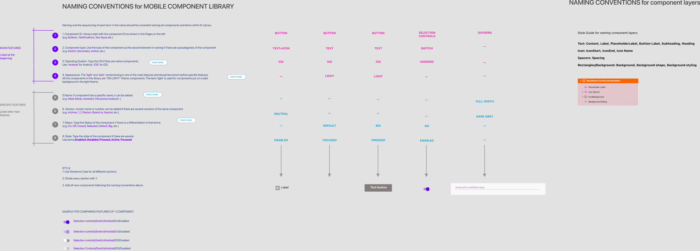
The naming convention, written down
Eight rules for how every component gets named: component ID, type, operating system, appearance, name, version, status, state. A sample matrix at the right shows the rules applied to one component. Newcomers stop asking what to call things; the file already answered.
What shipped
The migration finished and the Sketch file was retired. The Figma library became the only place a brand-app designer goes to find a component. The product it underpins went on to win at the UX Design Awards 2023.
- Every screen rebuilt on the real components: each component and screen flow moved from Sketch to Figma on the actual library instances. One change to a component propagated to every screen that used it.
- One library, all brands: a single Figma file consumed by the Signia App and the sister-brand apps. No more forks, no more drift.
- Atomic structure with auto-layout on every component: resize without duplication, retheme without copying, ship to iOS and Android from the same source.
- Documentation in the file: contribution rules, anatomy diagrams, release notes. New designers onboarded in an afternoon instead of a week.
- UX Design Awards 2023, Medical Software: RTApp for hearing aids of WS Audiology won. Every screen in the entry came from this library.
What the migration taught me
Migrating tools is the cheap part
The Sketch-to-Figma jump itself was a week of mechanical work. The hard part was getting the budget to rebuild rather than translate. I had to convince stakeholders that an import would carry the same structural debt across, and that the migration was the cheapest window we had to fix it.
If I took this on today, tokens would be the base
In 2023, Color Styles were the furthest Figma let you go. The skinning engine for brand swap ran in code, written before I joined, with no design counterpart in the file. Today I would push for proper design tokens at the base: type, color, spacing, elevation. The library would consume them as Variables, and engineering would read the same exported token set.
Accessibility was half done
Contrast, text scale and touch targets were enforced at the foundation level. Type styles met WCAG AA, hit areas met the 44pt minimum, focus and pressed states were part of every Variant matrix. Screen-reader support is where it fell down. Read-order, labels and VoiceOver/TalkBack semantics were not part of the file's contract, and the previous app shipped with poor screen-reader behaviour as a result. See the accessibility evaluation of the previous app in the Bluetooth pairing case. The annotation system I built later, on a separate project, was the answer; if I rebuilt RTApps today, that layer would be in from day one.