Personal project · 2026
This Portfolio
Sole designer and direction · Claude Code · HTML/CSS
Hand-written HTML/CSS, live on Vercel, WCAG AA across 11 case pages. One design system reskinned by a per-case accent. No framework, no build step. Directed solo with Claude as typing partner.
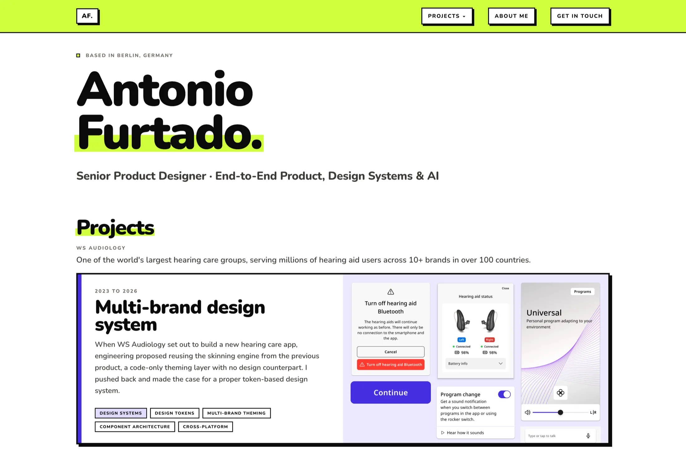
I built my portfolio the way I’d build a product: brief, constraints, small design system, shipped.
I wrote every line of HTML and CSS with Claude as my implementation partner. No Webflow, no template, no developer handoff. The brief, the critique and the direction stayed with me.
Constraints first
I started by defining what I wouldn’t do.
| Constraint | Decision | Why |
|---|---|---|
| No build tooling | Plain HTML/CSS, no Webpack, no framework | No deploy friction. Vercel serves the static files as they are. |
| Solo, no design team | AI as implementation and critique partner | I directed the build myself to sharpen the skill instead of outsourcing it. |
| Must be accessible | WCAG AA throughout | Accessibility runs through my case work, so the portfolio had to prove it in practice. |
| No AI-generated look | Every visual decision owned manually | AI-built portfolios tend to look alike, and I wanted to avoid that tell. |
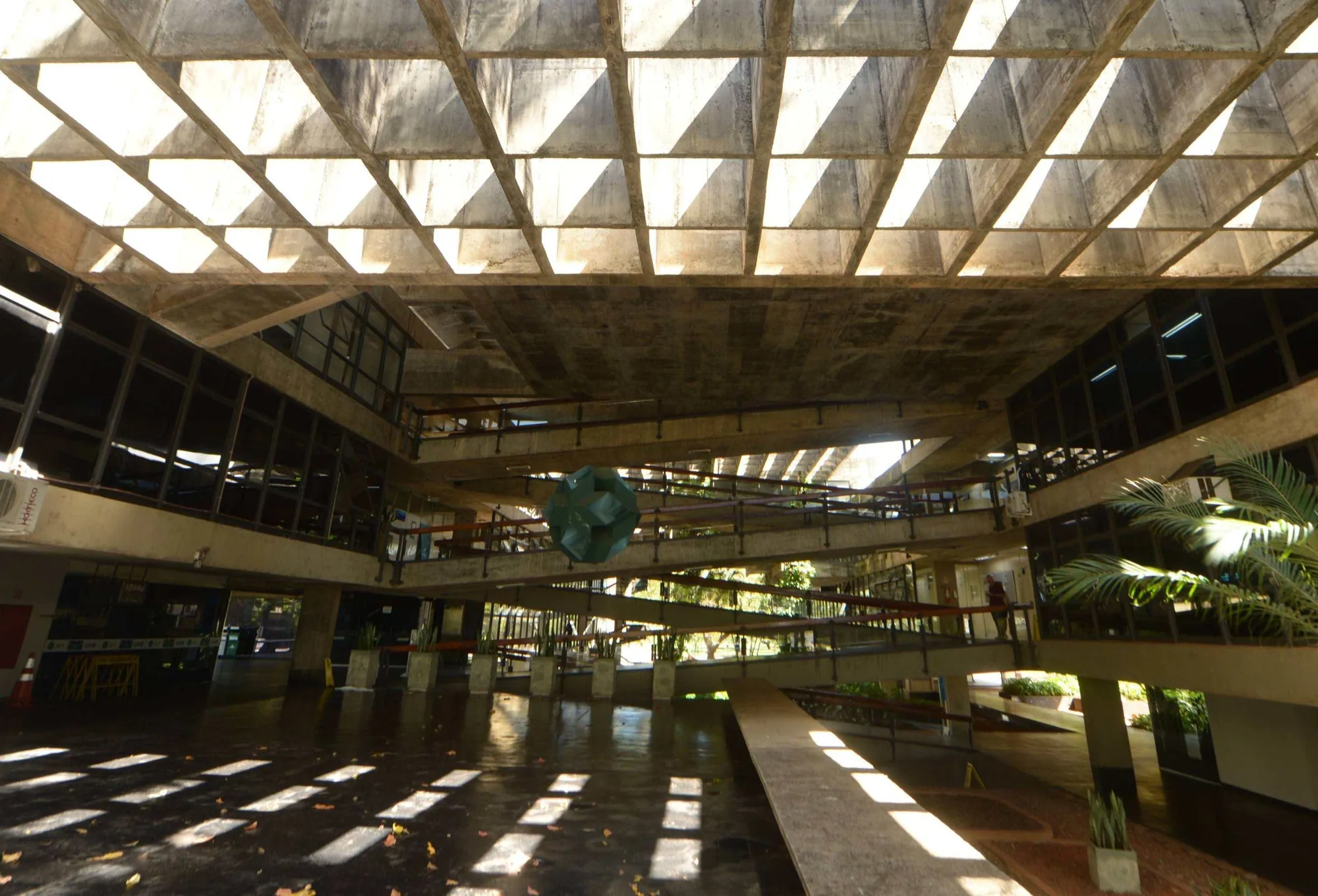
It comes from Brasília
I grew up in Brasília, a city designed from scratch, where the bones of a building are always left showing: raw concrete, exposed structure, load-bearing logic on display.
Brutalism there was never about ugliness. It was about honesty. The thick borders and hard shadows are the structure, left on show on purpose. The colours are mine, a bit plural and a bit loud, not pulled from a UI kit.
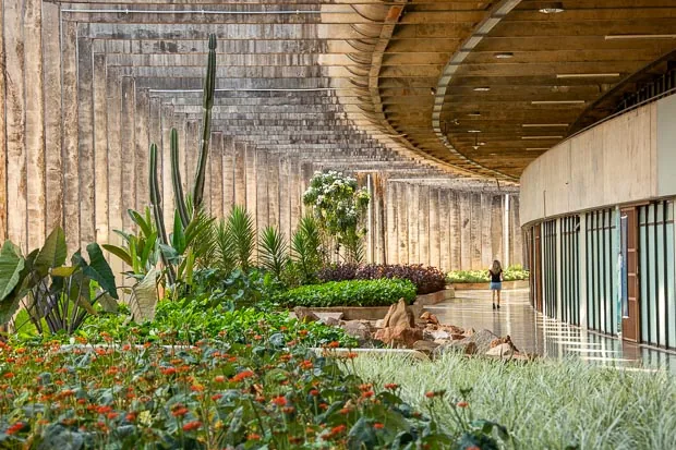
A building in Brasília is never only concrete. Green grows through it and flowers break against the grey. The accent colours across this portfolio are those: the loud greens, oranges and pinks of Brazilian nature.
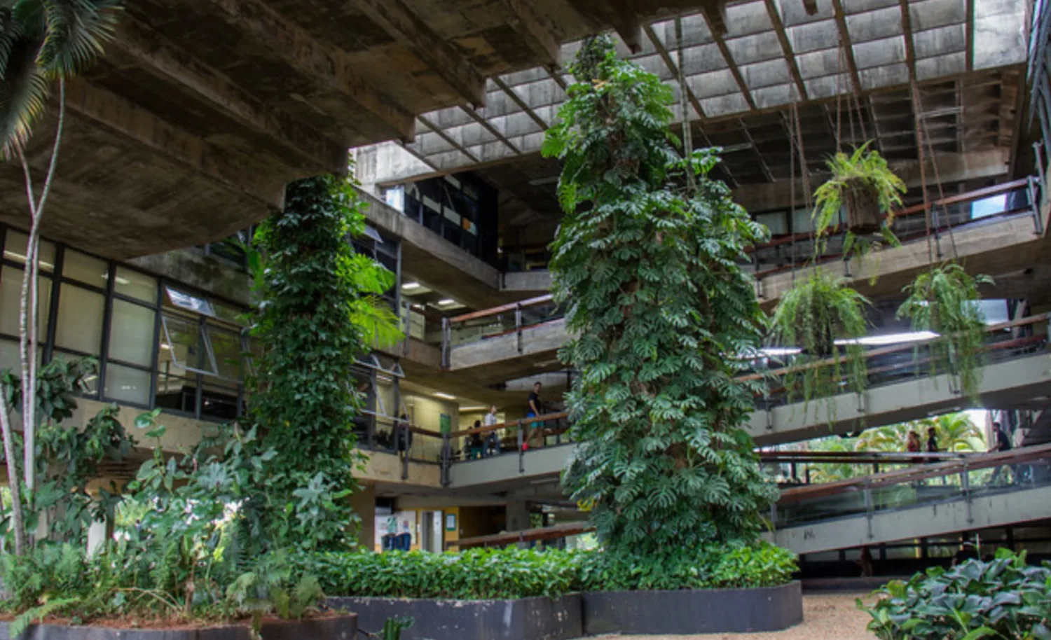
The borders and shadows are the structure. The colours are what grows through it.
Design structure
The token set is deliberately small, and I decided each value rather than reaching for a default: a warm off-white ground (#F7F6F3) under near-black ink (#0A0A0A, softer than pure black), two warm greys for text, one structural 2px black border, a lime accent plus a per-case accent, and three hard-offset shadow steps. Type is the neubrutalism.com pairing: Syne for display, Space Grotesk for headings, Inter for body, Space Mono for meta labels and chips, with sizes snapped to a fixed rem scale and the big type set in clamp() so it flexes without a breakpoint each. Spacing follows a four-step rhythm, from tight padding inside chips and buttons up to the 4.5rem gap between sections. Shared universal patterns live in assets/design-tokens.css and a numbered table of contents in assets/toc-numbered.js, so every case inherits the same nav dropdown, hero-takeaway treatment, screen-caption strip and TOC. One place to edit, eleven pages updated.
Shadows mean you can touch it
A shadow marks anything pressable: buttons, cards, nav links, the TOC button. All three steps are hard offset, no blur. A card lifts on hover and sinks on click, so it reads as physical weight. Blur would soften that, so it stays out.
Per-case accent system
Each case redefines --accent locally, one colour per project, picked to fit the character of the work.
Three patterns
Each of these three interactions needed a real UX decision.
.card-cta::after { content:''; position:absolute; inset:0; }. One focusable element per card, fully tappable, so keyboard users tab through cards instead of through every link inside them, and screen readers get one clear label.<abbr title="..."> with a CSS ::before/::after tooltip. No JS, no library, consistent across every case file. Context lands inline.Reflow, not horizontal scroll
Built desktop-first, tested down to 320px. Three breakpoints do most of the work: 900px drops two-column grids and data tables to one column, 640px tightens the gutters, 600px swaps the top nav for a fixed bottom tab bar.
Nothing is hidden on mobile and nothing overflows sideways. The one horizontal scroll is the "More cases" strip at the bottom, which is deliberate.
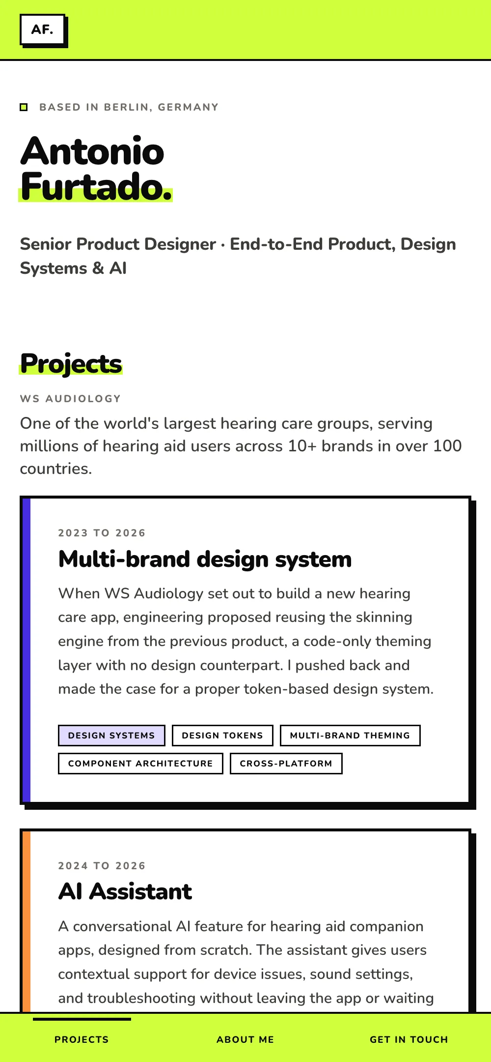
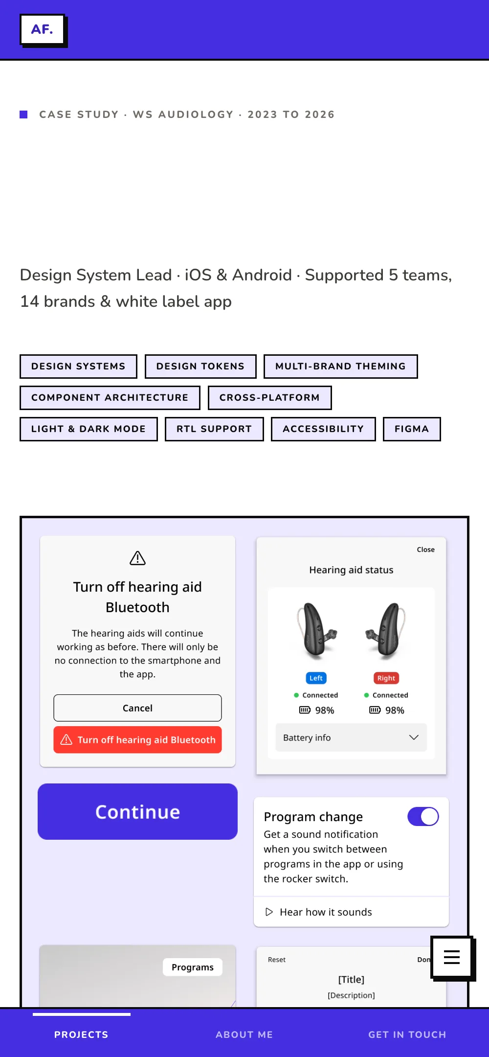
Reflow is the test: content has to stay usable at 320px wide and 400% zoom with no horizontal scrollbar. Every table on the site collapses to one column to pass it.
AI as implementation partner
I built the site over several sessions in Cowork, the Claude desktop app, with Claude as implementation partner. Pairing with a very fast developer who needs clear direction on everything that matters.
- Visual direction: colours, type, layout
- Copy: all case text, labels, taglines
- Design decisions: what to include, what to cut
- Critique: what’s wrong, what to change
- Accessibility requirements
- QA verdicts: approve / reject / fix
- Writing all HTML/CSS
- Suggesting structure when asked
- Flagging implementation options
- Executing changes precisely
- Implementing semantic HTML and ARIA
- Running structured QA review
Vague direction gives generic output. Specific direction gives something that looks designed.
Built in from the start
Accessibility runs through my case work, so the portfolio had to prove it in practice.
- Skip link to
#main, visible on focus, so keyboard users can bypass the nav. - Semantic landmarks:
<nav>,<main>,<section aria-labelledby>, so screen-reader navigation works. - Card accessibility: one focusable element per card, not a stack of links. A
role="list"container with a labelled link. - Focus ring: 3px solid black, 3px offset. Visible and on-brand, not the default browser blue.
- Contrast enforcement: fixed hex values, not opacity hacks.
opacity: 0.4on small text fails AA, so every value is set explicitly at 4.5:1 or better. - Reduced motion:
@media (prefers-reduced-motion: reduce)drops every transition. - Focus & keyboard: section labels are real tab stops; the nav ring is dual white-plus-black, so it stays visible on any accent.
- Per-accent contrast: light accents (lime, yellow, coral) switch to a darkened token for text and black on fills, so every case clears WCAG AA.
Shipped, and live:
The portfolio is in production.
- Live on Vercel as a static site, served straight from hand-written HTML and CSS, with no framework and no build step.
- WCAG AA across all eleven case pages: keyboard focus order, contrast, reflow to 320px, reduced-motion support, and semantic landmarks.
- One design system, eleven cases. Each retheme is a single accent token, so a new case inherits the whole frame for free.
- Written as I built it, rather than reconstructed afterwards.
- Owned end to end by one designer: the brief, the copy, the visual direction, the accessibility, and the code.
What I’d do differently:
- Be specific earlier: Precise direction ("change this stripe from yellow to lime, text stays black") works. Writing down exactly what something should do becomes the prompt.
- Log decisions as they happen: A live log keeps the reasoning findable and catches contradictions early.
What I got right:
- Treating the portfolio as a product: Brief, constraints, audience, then design.
- The per-case accent system: Solves visual variety without a different layout for every case.
- The collaboration model: Direction from me, execution from Claude.
A designer can own the full product stack, from concept to shipped accessible site, without being an engineer. AI lifts the floor on execution; the ceiling on thinking is still yours to raise.